
1 Hourly energy demand generation and weather
2 Project description
The dataset contains 4 years of electrical consumption, generation, pricing, and weather data for Spain. Consumption and generation data was retrieved from ENTSOE a public portal for Transmission Service Operator (TSO) data. Settlement prices were obtained from the Spanish TSO Red Electric España. Weather data was purchased as part of a personal project from the Open Weather API for the 5 largest cities in Spain. The original datasets can be downloaded from Kaggle. However, the dataset to be used for the project has been already pre-processed. The code used for preprocessing is in this github repository, while the dataset to be used can be downloaded here.
- date: datetime index localized to CET.
- date_day: date without hour.
- city: reference city. (
Valencia.Madrid,Bilbao,Barcelona,Seville) - Year: number for the year.
- Month: number for the month.
- Day: number for the day in a month.
- Hour: reference hour of the day.
Energy variables
- fossil: energy produced with fossil sources: i.e. coal/lignite, natural gas, oil (MW).
- nuclear: energy produced with nuclear sources (MW).
- energy_other: other generation (MW).
- solar: solar generation (MW).
- biomass: biomass generation (MW).
- river: hydroeletric generation (MW).
- wind: wind generation (MW).
- energy_other_renewable: other renewable generation (MW).
- energy_waste: wasted generation (MW).
- pred_solar: forecasted solar generation (MW).
- pred_demand: forecasted electrical demand by TSO (MW).
- pred_price: forecasted day ahead electrical price by TSO (Eur/MWh).
- price: actual electrical price (Eur/MWh).
- demand: actual electrical demand (Eur/MWh).
- prod_tot: total electrical production (MW).
- prod_renewable: total renewable electrical production (MW).
Weather variables
- temp: mean temperature.
- temp_min: minimum temperature (degrees).
- temp_max: maximum temperature (degrees).
- pressure: pressure in (hPas).
- humidity: humidity in percentage.
- wind_speed: wind speed (m/s).
- wind_deg: wind direction.
- rain_1h: rain in last hour (mm).
- rain_3h: rain in last 3 hours (mm).
- snow_3h: show last 3 hours (mm).
- clouds_all: cloud cover in percentage.
Import data
dir_data <- "../grenfin-summer-school/data"
filepath <- file.path(dir_data, "data.csv")
data <- readr::read_csv(filepath, show_col_types = FALSE, progress = FALSE)
head(data) %>%
  knitr::kable(booktabs = TRUE ,escape = FALSE, align = 'c')%>%
kableExtra::row_spec(0, color = "white", background = "green")| date | date_day | Year | Month | Day | Hour | Season | fossil | nuclear | energy_other | solar | biomass | river | energy_other_renewable | energy_waste | wind | pred_solar | pred_demand | pred_price | demand | price | prod | prod_renewable | temp | temp_min | temp_max | pressure | humidity | wind_speed | wind_deg | rain_1h | rain_3h | snow_3h | clouds_all |
|---|---|---|---|---|---|---|---|---|---|---|---|---|---|---|---|---|---|---|---|---|---|---|---|---|---|---|---|---|---|---|---|---|---|
| 2014-12-31 23:00:00 | 2014-12-31 | 2014 | 12 | 31 | 23 | Winter | 10156 | 7096 | 43 | 49 | 447 | 3813 | 73 | 196 | 6378 | 17 | 26118 | 50.10 | 25385 | 65.41 | 27939 | 10687 | -0.6585375 | -5.825 | 8.475 | 1016.4 | 82.4 | 2.0 | 135.2 | 0 | 0 | 0 | 0 |
| 2015-01-01 00:00:00 | 2015-01-01 | 2015 | 1 | 1 | 0 | Winter | 10437 | 7096 | 43 | 50 | 449 | 3587 | 71 | 195 | 5890 | 16 | 24934 | 48.10 | 24382 | 64.92 | 27509 | 9976 | -0.6373000 | -5.825 | 8.475 | 1016.2 | 82.4 | 2.0 | 135.8 | 0 | 0 | 0 | 0 |
| 2015-01-01 01:00:00 | 2015-01-01 | 2015 | 1 | 1 | 1 | Winter | 9918 | 7099 | 43 | 50 | 448 | 3508 | 73 | 196 | 5461 | 8 | 23515 | 47.33 | 22734 | 64.48 | 26484 | 9467 | -1.0508625 | -6.964 | 8.136 | 1016.8 | 82.0 | 2.4 | 119.0 | 0 | 0 | 0 | 0 |
| 2015-01-01 02:00:00 | 2015-01-01 | 2015 | 1 | 1 | 2 | Winter | 8859 | 7098 | 43 | 50 | 438 | 3231 | 75 | 191 | 5238 | 2 | 22642 | 42.27 | 21286 | 59.32 | 24914 | 8957 | -1.0605312 | -6.964 | 8.136 | 1016.6 | 82.0 | 2.4 | 119.2 | 0 | 0 | 0 | 0 |
| 2015-01-01 03:00:00 | 2015-01-01 | 2015 | 1 | 1 | 3 | Winter | 8313 | 7097 | 43 | 42 | 428 | 3499 | 74 | 189 | 4935 | 9 | 21785 | 38.41 | 20264 | 56.04 | 24314 | 8904 | -1.0041000 | -6.964 | 8.136 | 1016.6 | 82.0 | 2.4 | 118.4 | 0 | 0 | 0 | 0 |
| 2015-01-01 04:00:00 | 2015-01-01 | 2015 | 1 | 1 | 4 | Winter | 7962 | 7098 | 43 | 34 | 410 | 3804 | 74 | 188 | 4618 | 4 | 21441 | 35.72 | 19905 | 53.63 | 23926 | 8866 | -1.1260000 | -7.708 | 7.317 | 1017.4 | 82.6 | 2.4 | 174.8 | 0 | 0 | 0 | 0 |
3 Part A: Descriptive analysis
Consider the data of the energy market in Spain and let’s examine the composition of the energy mix. At your disposal you have 6 sources that generate energy, i.e. 4 renewable (columns biomass, solar, river, wind) and 2 non-renewable (columns nuclear, fossil). The column demand represents the amount of demanded electricity in MW for a given day, denoted as \(D_t\). Let’s denote the energy of the \(\ast\)-th source as \[
E^{\boldsymbol{\ast}}_{t} =
\begin{cases}
E^{b}_{t} \quad \boldsymbol{\ast} \to b = \text{biomass} \\
E^{s}_{t} \quad \boldsymbol{\ast} \to s = \text{solar} \\
E^{h}_{t} \quad \boldsymbol{\ast} \to h = \text{hydroelettric} \\
E^{w}_{t} \quad \boldsymbol{\ast} \to w = \text{wind} \\
E^{n}_{t} \quad \boldsymbol{\ast} \to n = \text{nuclear} \\
E^{f}_{t} \quad \boldsymbol{\ast} \to f = \text{fossil} \\
E^{o}_{t} \quad \boldsymbol{\ast} \to o = \text{others} \\
\end{cases}
\tag{1}\] where others is the sum of the column energy_other and energy_other_renewable.
3.1 Task A.1
Let’s decompose the total demand across all the sources by defining share of demand met by source \(\ast\), i.e. \[ s^{\ast}_{t} = \frac{E^{\ast}_{t}}{D_t} \tag{2}\] where \(E^{\ast}_{t}\) is defined as in Equation 1. Then, let’s compute the average share of demand \(\bar{s}^{\ast}\) between the electricity produced from each source and the total electricity demanded from the market, i.e. \[ \bar{s}^{\ast} = \frac{1}{n} \sum_{t = 1}^{n} s_{t}^{\ast} \tag{3}\] Then, rank the first 5 sources by the percentage of demand satisfied with respect to the total demand in decreasing order. Plot the results with an histogram. Which is the source of energy that, on average, satisfy most of the electricity demand?
Figure average ratio between production and demand.
var_levels <- c("other", "biomass", "solar", "hydroelettric", "wind", "nuclear", "fossil")
var_labels <- c("other", "Biomass", "Solar", "Hydroelettric", "Wind", "Nuclear", "Fossil")
# Compute the ratio of the demand satisfied with respect to total demand
df_A1 <- data %>%
  dplyr::summarise(other = mean((energy_other+energy_other_renewable)/demand),
                   biomass = mean(biomass/demand),
                   solar = mean(solar/demand),
                   hydroelettric = mean(river/demand),
                   wind = mean(wind/demand),
                   nuclear = mean(nuclear/demand),
                   fossil = mean(fossil/demand))%>%
  tidyr::gather(key = "source", value = "perc")
# Categorical variable (plots purposes)
df_A1$id <- factor(df_A1$source, levels = var_levels, labels = var_labels)

# Figure
df_A1 %>%
  arrange(desc(perc)) %>%
  head(n = 7) %>%
  ggplot()+
  geom_bar(aes(id, perc, fill = source), color = "black", stat = "identity")+
  theme_bw()+
  custom_theme+
  theme(legend.position = "none")+
  scale_fill_manual(values = c(fossil = "#65880f", nuclear = "#0477BF", biomass = "brown",
                               solar = "darkorange", hydroelettric = "blue", wind = "gray", other = "black"))+
  scale_y_continuous(breaks = seq(0, 1, 0.05),
                     labels = paste0(seq(0, 1, 0.05)*100, " %"))+
  labs(fill = NULL, x = NULL, y = NULL)

# Rank the sources in decreasing order
vec_max <- df_A1$perc
names(vec_max) <- var_labels
vec_max_sort <- vec_max[order(vec_max, decreasing = TRUE)]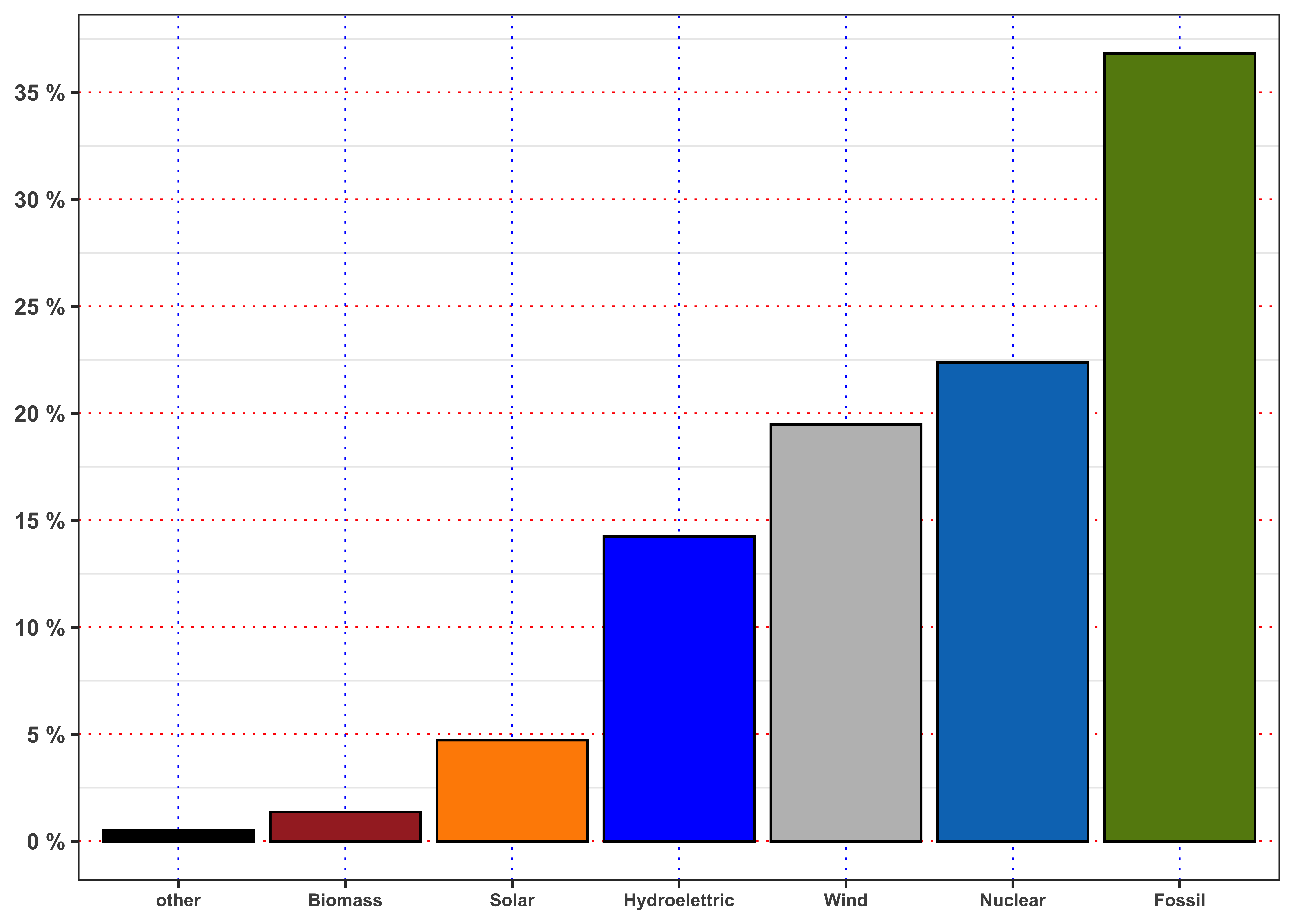
Solution: ranked sources
# Rank the sources in decreasing order
vec_max <- df_A1$perc
names(vec_max) <- var_labels
vec_max_sort <- vec_max[order(vec_max, decreasing = TRUE)]
# Generate the response based on previous computations
response <- ""
for(i in 1:length(vec_max_sort)){
  response <- paste0(response, " The ", i, "°",  " source with respect to production/demand is ", names(vec_max_sort[i]), " (", round(vec_max_sort[i]*100, 2), "%).")
}
The 1° source with respect to production/demand is Fossil (36.82%). The 2° source with respect to production/demand is Nuclear (22.37%). The 3° source with respect to production/demand is Wind (19.48%). The 4° source with respect to production/demand is Hydroelettric (14.24%). The 5° source with respect to production/demand is Solar (4.73%). The 6° source with respect to production/demand is Biomass (1.37%). The 7° source with respect to production/demand is other (0.52%).
3.2 Task A.2
Aggregate the sources of energy in two groups:
- Renewable: computed as the sum of
solar,river,windandbiomass. - Non-renewable: computed as the sum of
nuclearandfossil.
Then, compute the percentage of energy demand satisfied by each group. What is the percentage of energy satisfied by renewable sources? And by the fossil ones?
Repeat the computations, but filtering the data firstly only for year 2015 and then only for 2018. Are the percentage obtained different? Describe the result and explain if the transition to renewable energy is supported by data (to be supported the percentage of renewable energy should increase while percentage of fossil fuels should decrease.)
The percentage of demand satisfied by renewable sources is 39.82 %. Instead, the percentage of demand satisfied by fossil and nuclear sources is 59.19 %. The ratio of the fossil plus nuclear is 46.73 % bigger with respect to renewable sources.
Solution: transition 2015-2019
# Percentage of demand by source in 2015
df_A2_2015 <- data %>%
  filter(Year == 2015) %>%
  summarise(other = mean((energy_other+energy_other_renewable)/demand),
            biomass = mean(biomass/demand, na.rm = TRUE),
            solar = mean(solar/demand, na.rm = TRUE),
            hydroelettric = mean(river/demand, na.rm = TRUE),
            wind = mean(wind/demand, na.rm = TRUE),
            nuclear = mean(nuclear/demand, na.rm = TRUE),
            fossil = mean(fossil/demand, na.rm = TRUE))%>%
  gather(key = "source", value = "perc")
df_A2_2015 <-  filter(df_A2_2015, source != "other")
# Normalize
df_A2_2015$perc <- df_A2_2015$perc/sum(df_A2_2015$perc)
# Categorical variable (plots purposes)
df_A2_2015$id <- factor(df_A2_2015$source, levels = var_levels[-1], labels = var_labels[-1])

# Percentage of demand by source in 2018
df_A2_2018 <- data %>%
  filter(Year == 2018) %>%
  summarise(other = mean((energy_other+energy_other_renewable)/demand),
            biomass = mean(biomass/demand, na.rm = TRUE),
            solar = mean(solar/demand, na.rm = TRUE),
            hydroelettric = mean(river/demand, na.rm = TRUE),
            wind = mean(wind/demand, na.rm = TRUE),
            nuclear = mean(nuclear/demand, na.rm = TRUE),
            fossil = mean(fossil/demand, na.rm = TRUE))%>%
  gather(key = "source", value = "perc")
df_A2_2018 <-  filter(df_A2_2018, source != "other")
# Normalize
df_A2_2018$perc <- df_A2_2018$perc/sum(df_A2_2018$perc)
# Categorical variable (plots purposes)
df_A2_2018$id <- factor(df_A2_2018$source,  levels = var_levels[-1], labels = var_labels[-1])
# Response
response <- paste0(
  "In 2015 the percentage of demand satisfied by renewable sources was ",
  round(sum(df_A2_2015$perc[1:4])*100, 3), " %, while in 2018 was ",
  round(sum(df_A2_2018$perc[1:4])*100, 3), " %. ",
  "Hence, the dominance of renewable sources in this period increased by ",
  round((sum(df_A2_2018$perc[1:4])/sum(df_A2_2015$perc[1:4])-1)*100, 3), " %.",
  " Instead, in 2015 the percentage of demand satisfied by fossil and nuclear sources was ",
  round(sum(df_A2_2015$perc[5:6])*100, 3), " %, while in 2018 was ",
  round(sum(df_A2_2018$perc[5:6])*100, 3), " %. ",
  "Hence, the dominance of fossil sources in this period decreased by ",
  round((sum(df_A2_2018$perc[5:6])/sum(df_A2_2015$perc[5:6])-1)*100, 3),
  " %. and the transition seems to be supported by data."
)
In 2015 the percentage of demand satisfied by renewable sources was 39.335 %, while in 2018 was 42.132 %. Hence, the dominance of renewable sources in this period increased by 7.111 %. Instead, in 2015 the percentage of demand satisfied by fossil and nuclear sources was 60.665 %, while in 2018 was 57.868 %. Hence, the dominance of fossil sources in this period decreased by -4.611 %. and the transition seems to be supported by data.
3.3 Task A.3
For each month, compute the mean percentage of demand of energy satisfied by the fossil sources. In order to compute \(D^{{\boldsymbol{\ast}}}_m\) for the \(m\)-month, let’s denote with \(n_m\) the number of day in that month, then: \[ D^{{\boldsymbol{\ast}}}_m = \frac{1}{n_m} \sum_{t = 1}^{n_m} \frac{E^{\boldsymbol{\ast}}_{t}}{D_{t}} = \frac{1}{n_m} \sum_{t = 1}^{n_m} D^{{\boldsymbol{\ast}}}_t \tag{4}\]
Compute also the maximum, minimum, median and standard deviation of \(D^{{\boldsymbol{\ast}}}_t\) for each month. Repeat the computation for the others 4 sources of energy, i.e. nuclear, solar, river and wind. Which are the source with the lowest and the highest standard deviation in December? And in June? Comment the results obtained (max 200 words).
create_monthly_kable()
create_monthly_kable <- function(data, target = "fossil"){
  data[["target"]] <- data[[target]]
  data <- data %>%
    mutate(Month = lubridate::month(date_day, label = TRUE)) %>%
    group_by(Month) %>%
    mutate(target = target/demand) %>%
    summarise(min = min(target, na.rm = TRUE),
              mean = mean(target, na.rm = TRUE),
              meadian = median(target, na.rm = TRUE),
              max = max(target, na.rm = TRUE),
              sd = sd(target))

  kab <- data %>%
    mutate_if(is.numeric, ~.x*100) %>%
    mutate(sd = paste0(format(sd, digits = 4), " %"))%>%
    mutate_if(is.numeric,  ~paste0(format(.x, digits = 4), " %")) %>%
  knitr::kable(booktabs = TRUE, escape = FALSE, align = 'c') %>%
  kableExtra::row_spec(0, color = "white", background = "green")

  structure(
    list(
      data = data,
      kab = kab

    )
  )
}| Month | min | mean | meadian | max | sd |
|---|---|---|---|---|---|
| Jan | 10.607 % | 36.87 % | 38.61 % | 66.58 % | 10.082 % |
| Feb | 9.125 % | 32.48 % | 32.21 % | 67.95 % | 11.214 % |
| Mar | 13.351 % | 29.39 % | 26.56 % | 69.18 % | 10.438 % |
| Apr | 12.396 % | 31.03 % | 28.80 % | 70.62 % | 11.246 % |
| May | 9.976 % | 33.35 % | 33.01 % | 76.60 % | 10.764 % |
| Jun | 12.730 % | 36.97 % | 37.35 % | 75.26 % | 11.359 % |
| Jul | 14.677 % | 39.85 % | 40.64 % | 63.78 % | 9.407 % |
| Aug | 13.075 % | 38.00 % | 38.82 % | 60.91 % | 8.791 % |
| Sep | 12.927 % | 39.40 % | 40.53 % | 68.04 % | 9.156 % |
| Oct | 12.531 % | 41.37 % | 41.69 % | 72.10 % | 10.998 % |
| Nov | 12.924 % | 44.10 % | 45.71 % | 78.15 % | 12.626 % |
| Dec | 13.891 % | 38.77 % | 39.69 % | 67.38 % | 11.030 % |
| Month | min | mean | meadian | max | sd |
|---|---|---|---|---|---|
| Jan | 12.271 % | 22.74 % | 21.86 % | 39.22 % | 4.498 % |
| Feb | 11.660 % | 22.56 % | 21.77 % | 38.42 % | 4.655 % |
| Mar | 13.040 % | 23.46 % | 22.74 % | 36.57 % | 4.504 % |
| Apr | 12.624 % | 23.13 % | 22.65 % | 37.64 % | 4.906 % |
| May | 4.999 % | 20.40 % | 19.98 % | 37.59 % | 3.990 % |
| Jun | 12.569 % | 21.17 % | 20.67 % | 37.76 % | 4.381 % |
| Jul | 12.390 % | 21.65 % | 21.09 % | 34.93 % | 3.956 % |
| Aug | 12.780 % | 23.61 % | 23.08 % | 34.00 % | 4.113 % |
| Sep | 13.929 % | 23.65 % | 22.98 % | 35.29 % | 4.348 % |
| Oct | 14.127 % | 23.09 % | 22.54 % | 35.85 % | 4.503 % |
| Nov | 0.000 % | 19.82 % | 19.25 % | 33.38 % | 4.343 % |
| Dec | 13.425 % | 23.08 % | 22.31 % | 39.37 % | 5.219 % |
| Month | min | mean | meadian | max | sd |
|---|---|---|---|---|---|
| Jan | 1.1883 % | 21.80 % | 20.39 % | 62.26 % | 11.609 % |
| Feb | 1.5627 % | 22.85 % | 21.24 % | 61.05 % | 13.511 % |
| Mar | 1.5243 % | 24.03 % | 23.67 % | 64.02 % | 12.726 % |
| Apr | 1.8202 % | 20.14 % | 18.09 % | 64.49 % | 11.326 % |
| May | 1.1022 % | 19.88 % | 17.45 % | 57.96 % | 11.555 % |
| Jun | 1.0185 % | 18.12 % | 15.68 % | 65.36 % | 10.978 % |
| Jul | 0.6918 % | 15.96 % | 14.27 % | 59.08 % | 9.259 % |
| Aug | 0.7066 % | 16.75 % | 15.52 % | 57.37 % | 9.134 % |
| Sep | 0.9261 % | 16.05 % | 13.60 % | 56.38 % | 10.383 % |
| Oct | 0.7795 % | 19.22 % | 16.83 % | 62.57 % | 12.014 % |
| Nov | 0.0000 % | 18.93 % | 16.16 % | 69.16 % | 12.136 % |
| Dec | 1.6081 % | 20.17 % | 18.12 % | 67.28 % | 12.108 % |
| Month | min | mean | meadian | max | sd |
|---|---|---|---|---|---|
| Jan | 2.983 % | 15.06 % | 13.798 % | 41.58 % | 6.731 % |
| Feb | 3.003 % | 17.33 % | 16.062 % | 42.13 % | 7.674 % |
| Mar | 2.540 % | 18.69 % | 18.987 % | 45.22 % | 7.715 % |
| Apr | 2.928 % | 18.84 % | 16.437 % | 49.09 % | 9.524 % |
| May | 2.858 % | 16.92 % | 15.327 % | 50.66 % | 8.092 % |
| Jun | 2.796 % | 13.81 % | 13.050 % | 38.07 % | 5.839 % |
| Jul | 2.261 % | 11.50 % | 10.293 % | 40.04 % | 5.887 % |
| Aug | 3.040 % | 10.94 % | 9.488 % | 43.30 % | 6.013 % |
| Sep | 2.635 % | 11.05 % | 9.611 % | 36.30 % | 5.534 % |
| Oct | 2.271 % | 11.61 % | 10.175 % | 44.41 % | 6.266 % |
| Nov | 0.000 % | 12.28 % | 11.021 % | 43.45 % | 6.441 % |
| Dec | 3.519 % | 13.11 % | 11.911 % | 46.06 % | 6.121 % |
| Month | min | mean | meadian | max | sd |
|---|---|---|---|---|---|
| Jan | 0.024068 % | 3.523 % | 0.7840 % | 25.38 % | 4.830 % |
| Feb | 0.006935 % | 3.966 % | 1.3321 % | 22.70 % | 5.080 % |
| Mar | 0.018776 % | 4.517 % | 2.0257 % | 21.22 % | 5.345 % |
| Apr | 0.009580 % | 4.986 % | 2.3468 % | 21.88 % | 5.572 % |
| May | 0.008510 % | 5.942 % | 3.0158 % | 22.48 % | 5.939 % |
| Jun | 0.011501 % | 6.248 % | 3.2706 % | 22.03 % | 5.761 % |
| Jul | 0.008478 % | 6.221 % | 2.9958 % | 23.40 % | 5.726 % |
| Aug | 0.009806 % | 5.774 % | 2.6587 % | 21.32 % | 5.825 % |
| Sep | 0.017305 % | 5.333 % | 2.2467 % | 23.02 % | 5.875 % |
| Oct | 0.007038 % | 3.767 % | 1.0721 % | 21.75 % | 4.974 % |
| Nov | 0.000000 % | 3.355 % | 0.6537 % | 18.63 % | 4.619 % |
| Dec | 0.008983 % | 3.063 % | 0.4059 % | 19.26 % | 4.386 % |
| Month | min | mean | meadian | max | sd |
|---|---|---|---|---|---|
| Jan | 0.7321 % | 1.404 % | 1.383 % | 2.630 % | 0.3501 % |
| Feb | 0.6226 % | 1.394 % | 1.380 % | 2.741 % | 0.3070 % |
| Mar | 0.4760 % | 1.334 % | 1.306 % | 2.680 % | 0.4059 % |
| Apr | 0.6078 % | 1.191 % | 1.147 % | 2.819 % | 0.3495 % |
| May | 0.0000 % | 1.394 % | 1.308 % | 2.718 % | 0.3703 % |
| Jun | 0.6752 % | 1.344 % | 1.277 % | 2.614 % | 0.3477 % |
| Jul | 0.6938 % | 1.365 % | 1.305 % | 2.719 % | 0.3265 % |
| Aug | 0.5274 % | 1.447 % | 1.373 % | 2.859 % | 0.3776 % |
| Sep | 0.5987 % | 1.424 % | 1.348 % | 2.809 % | 0.3834 % |
| Oct | 0.5433 % | 1.404 % | 1.314 % | 2.890 % | 0.4034 % |
| Nov | 0.0000 % | 1.372 % | 1.298 % | 2.830 % | 0.3720 % |
| Dec | 0.5796 % | 1.339 % | 1.284 % | 2.801 % | 0.3663 % |
Solution: June vs December
sd_june <- c(fossil = filter(df_fossil$data, Month == "Jun")$sd,
             nuclear = filter(df_nuclear$data, Month == "Jun")$sd,
             wind = filter(df_wind$data, Month == "Jun")$sd,
             hydro = filter(df_hydro$data, Month == "Jun")$sd,
             solar = filter(df_solar$data, Month == "Jun")$sd)

sd_dec <- c(fossil = filter(df_fossil$data, Month == "Dec")$sd,
            nuclear = filter(df_nuclear$data, Month == "Dec")$sd,
            wind = filter(df_wind$data, Month == "Dec")$sd,
            hydro = filter(df_hydro$data, Month == "Dec")$sd,
            solar = filter(df_solar$data, Month == "Dec")$sd)

min_sd_jun <- sd_june[order(sd_june, decreasing = FALSE)][1]
min_sd_dec <- sd_dec[order(sd_dec, decreasing = FALSE)][1]
max_sd_jun <- sd_june[order(sd_june, decreasing = FALSE)][length(sd_june)]
max_sd_dec <- sd_dec[order(sd_dec, decreasing = FALSE)][length(sd_dec)]
The nuclear energy has the lowest standard deviation of percentage demand satisfied in June with a standard deviation of 4.4 %. The maximum standard deviation is from fossil with 11 %.
Instead the solar energy has the lowest standard deviation of percentage demand satisfied in December with a standard deviation of 4.4 %. The maximum standard deviation is from wind with 12 %.
Figure percentage demand of energy by source
df_A3 <- data %>%
  mutate(Month = lubridate::month(date_day, label = TRUE)) %>%
  group_by(Month, Hour) %>%
  summarise(biomass = mean(biomass/demand, na.rm = TRUE),
            solar = mean(solar/demand, na.rm = TRUE),
            hydroelettric = mean(river/demand, na.rm = TRUE),
            wind = mean(wind/demand, na.rm = TRUE),
            nuclear = mean(nuclear/demand, na.rm = TRUE),
            fossil = mean(fossil/demand, na.rm = TRUE),
            demand = mean(demand, na.rm = TRUE))

ggplot(df_A3)+
    geom_line(aes(Hour, biomass, color = "biomass"))+
    geom_line(aes(Hour, solar, color = "solar"))+
    geom_line(aes(Hour, hydroelettric, color = "hydroelettric"))+
    geom_line(aes(Hour, wind, color = "wind"))+
    geom_line(aes(Hour, nuclear, color = "nuclear"))+
    geom_line(aes(Hour, fossil, color = "fossil"))+
    facet_wrap(~Month)+
    theme_bw()+
    custom_theme+
    scale_color_manual(values = c(fossil = "#65880f", nuclear = "#0477BF", biomass = "brown",
                                  solar = "darkorange", hydroelettric = "blue", wind = "gray"))+
    scale_y_continuous(breaks = seq(0, 1, 0.1),
                       labels = paste0(seq(0, 1, 0.1)*100, " %"))+
    labs(color = NULL, y = "Production/Demand")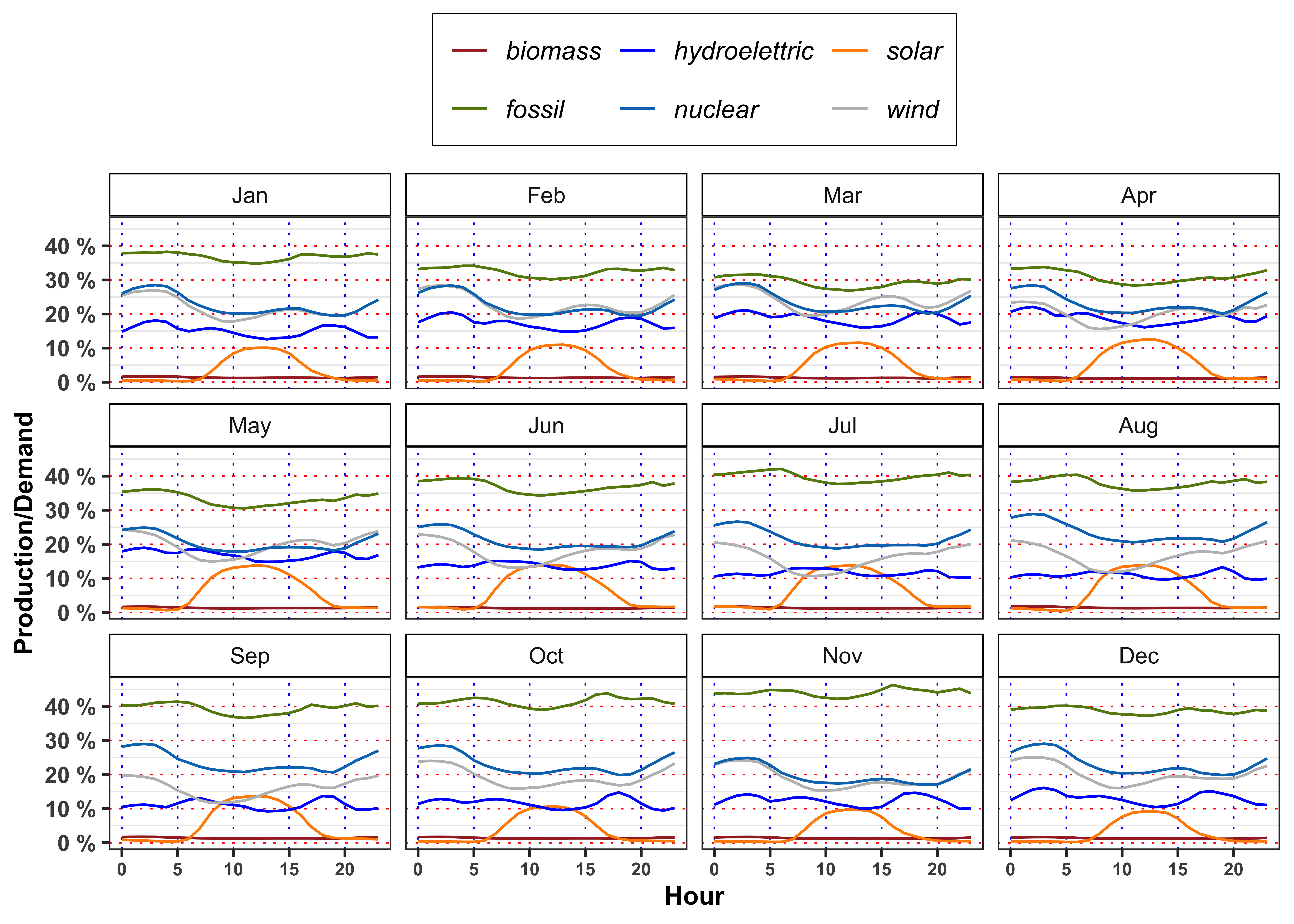
3.4 Task A.4
In mean, the demand satisfied by solar energy with respect to total demand is greater or lower with respect to the one satisfied by hydroelectric on 12:00 in March? In July, August and September at the same hour the situation changes? Answer, providing a possible explanation of the results obtained (max 200 words).
Code
df_A4 <- bind_rows(
   filter(df_A3, Month == "Mar" & Hour == 12),
   filter(df_A3, Month == "Jul" & Hour == 12),
   filter(df_A3, Month == "Aug" & Hour == 12),
   filter(df_A3, Month == "Sep" & Hour == 12)
)

df_A4 %>%
  mutate_if(is.numeric, ~.x*100) %>%
  mutate_if(is.numeric,  ~paste0(format(.x, digits = 3), " %"))  %>%
  mutate(demand = paste0(str_remove_all(demand, "\\%"), " MW"),
         Hour = paste0(as.numeric(str_remove_all(Hour, "\\%"))/100, ":00")) %>%
  knitr::kable(booktabs = TRUE, escape = FALSE, align = 'c') %>%
kableExtra::row_spec(0, color = "white", background = "green") | Month | Hour | biomass | solar | hydroelettric | wind | nuclear | fossil | demand |
|---|---|---|---|---|---|---|---|---|
| Mar | 12:00 | 1.19 % | 11.5 % | 16.7 % | 21.7 % | 20.9 % | 26.9 % | 3179217 MW |
| Jul | 12:00 | 1.19 % | 13.8 % | 11.8 % | 12.4 % | 19.1 % | 37.8 % | 3354479 MW |
| Aug | 12:00 | 1.28 % | 13.8 % | 10.3 % | 13.6 % | 20.9 % | 35.8 % | 3191764 MW |
| Sep | 12:00 | 1.28 % | 13.7 % | 9.6 % | 13.4 % | 21.3 % | 36.9 % | 3107519 MW |
3.5 Task A.5
Grouping the data by season and hour (\(4 \times 24\) groups) and by month and hour (\(12 \times 24\) groups) and compute:
- Average electricity price.
- Average ratio between total production and total demand, i.e.
prod/demand.
For both groups, answer to the following questions.
What is the meaning of a ratio between total production and total demand greater than 1? And greater than 1? Following the demand and supply law, what is the expected behavior of the price in such situations? Comment the results (max 200 words).
When the price reaches it’s minimum value? In such situation, does the ratio reach its maximum value? What happen when the prices reaches it’s maximum? Comment the results (max 200 words).
The minimum price for electricity by season and hour is reached, in mean, at 3:00 in all the seasons. Moreover, for all the seasons the ratio between production and demand is above 100% between 00:00 and 3:00 denoting a general excess of production with respect to the demand. Interestingly, when this ratio goes again above 100% again between 14:00 to 16:00 (except is summer) the price, in mean, reaches a relative minimum for the day.
On contrary the maximum price for the electricity, by season and hour is reached, in mean, at 19:00 except for Autumn (18:00). As expected, in the same period the production ratio reaches a minimum that for all the seasons is also a global minimum for the day.
In the monthly plots is highlighted the fact that is the drop in electricity price in 14:00 to 16:00 and the subsequent increase during the afternoon is smoothed going from May up to September.
Let’s compute the average by Season, Month, Weekday and Hour of the total production divided by the total demand.
Code
data %>%
  mutate(Weekday = weekdays(date)) %>%
  mutate(prod = prod/demand) %>%
  group_by(Weekday, Hour) %>%
  summarise(prod = mean(prod, na.rm = TRUE)) %>%
  ggplot()+
  geom_line(aes(Hour, prod), color = "black")+
  geom_line(aes(Hour, 1), color = "red", linetype = "dashed")+
  facet_wrap(~Weekday)+
  theme_bw()+
  custom_theme+
  scale_x_continuous(breaks = seq(0, 24, 4))+
  scale_y_continuous(breaks = seq(0, 2, 0.05),
                     labels = paste0(seq(0, 2, 0.05)*100, " %"))+
  labs(color = NULL, y = "Production/Demand")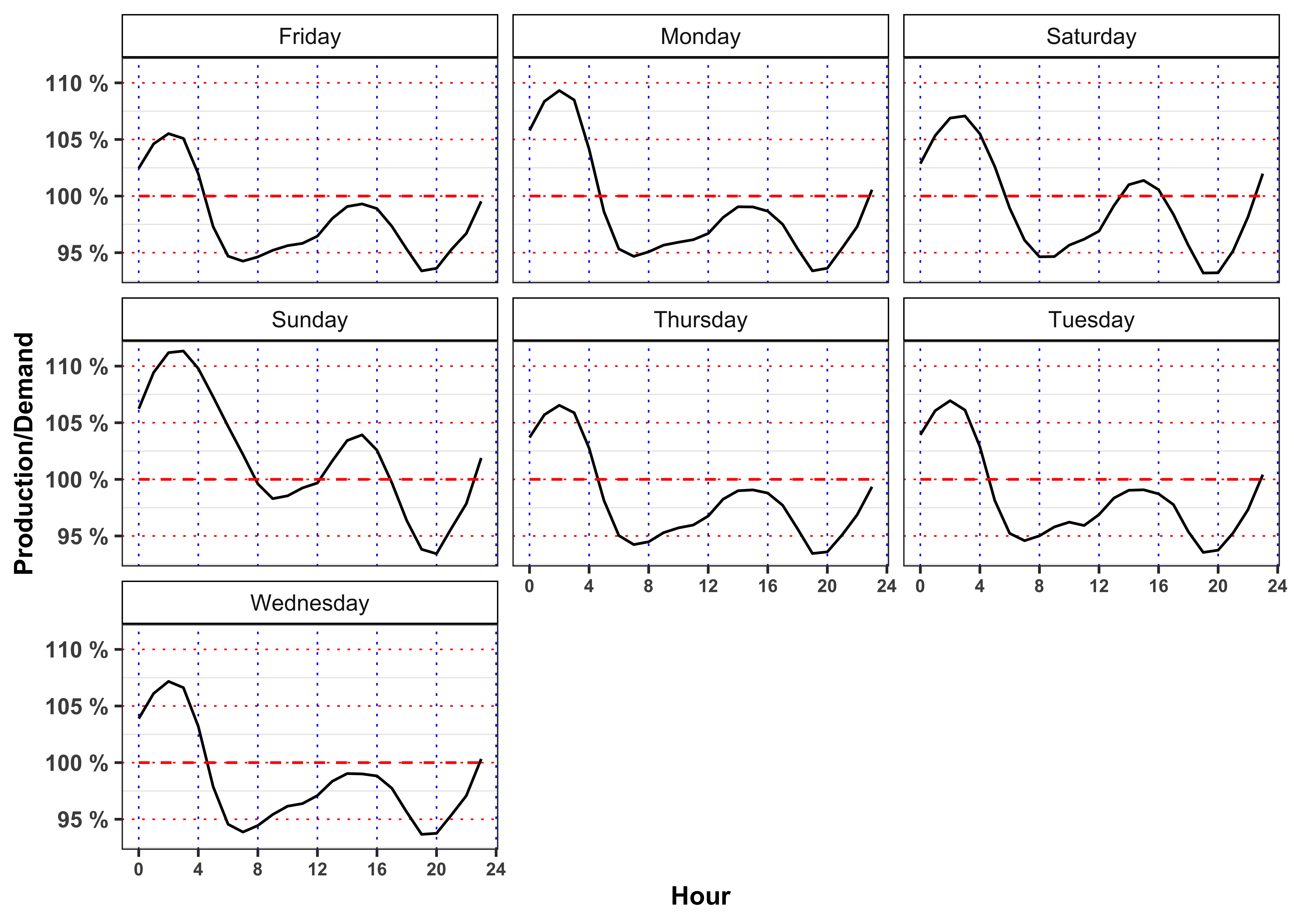
Code
data %>%
  mutate(Month = lubridate::month(date_day, label = TRUE)) %>%
  group_by(Month, Hour) %>%
  summarise(ratio = mean(prod/demand, na.rm = TRUE)) %>%
  ggplot()+
  geom_line(aes(Hour, ratio), color = "black")+
  geom_line(aes(Hour, 1), color = "red", linetype = "dashed")+
  facet_wrap(~Month)+
  scale_x_continuous(breaks = seq(0, 24, 4))+
  scale_y_continuous(breaks = seq(0, 2, 0.04),
                     labels = paste0(seq(0, 2, 0.04)*100, " %"))+
  theme_bw()+
  custom_theme+
  labs(color = NULL, y = "Production/Demand")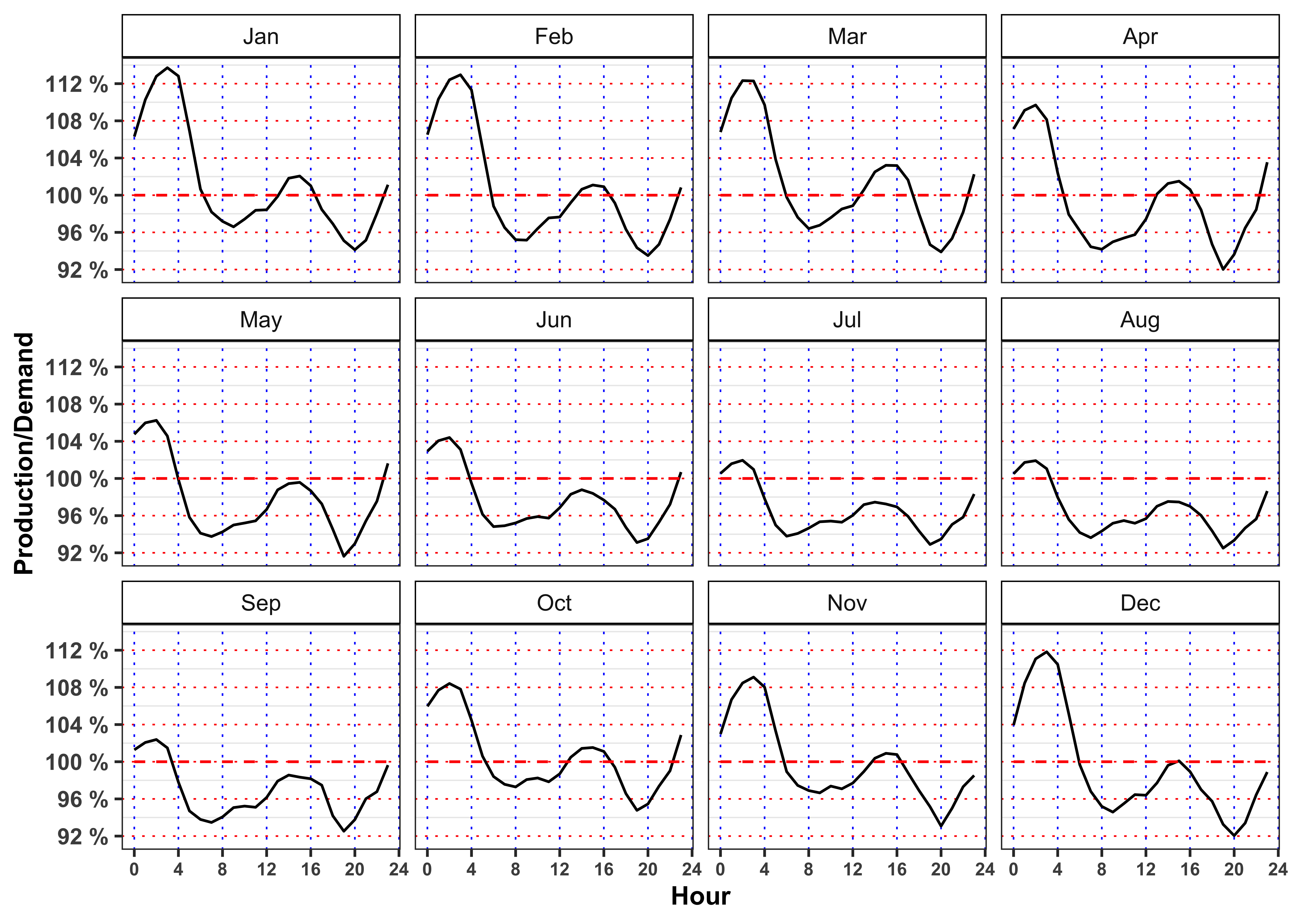
Code
data %>%
  mutate(prod = prod/demand) %>%
  group_by(Season, Hour) %>%
  summarise(prod = mean(prod, na.rm = TRUE)) %>%
  ggplot()+
  geom_line(aes(Hour, prod), color = "black")+
  geom_line(aes(Hour, 1), color = "red", linetype = "dashed")+
  facet_wrap(~Season)+
  theme_bw()+
  custom_theme+
  scale_x_continuous(breaks = seq(0, 24, 2))+
  scale_y_continuous(breaks = seq(0, 2, 0.05),
                     labels = paste0(seq(0, 2, 0.05)*100, " %"))+
  labs(color = NULL, y = "Production/Demand")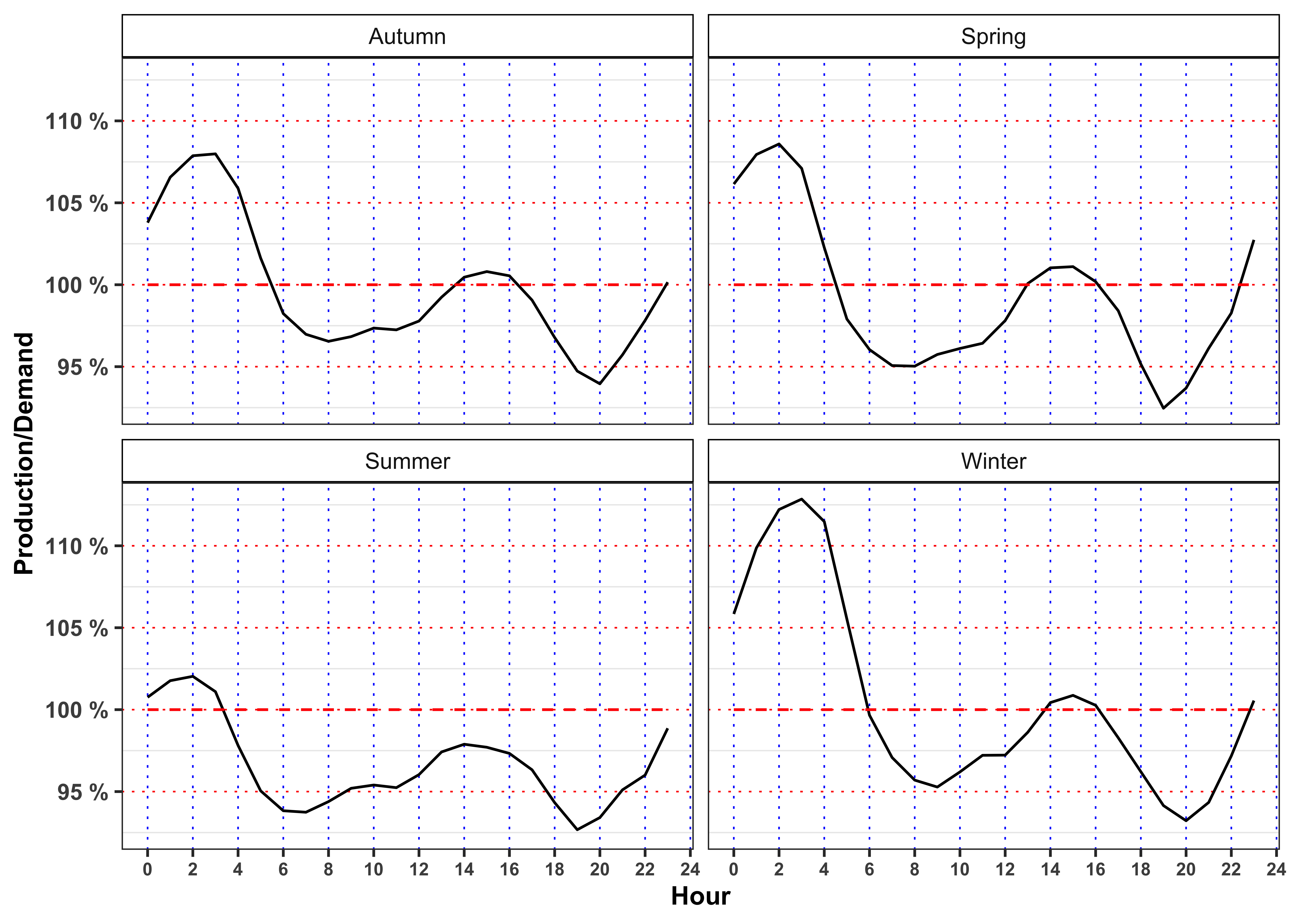
Let’s now compute the average by Season, Month, Weekday and Hour of the electricity price.
Code
data %>%
  mutate(Month = lubridate::month(date_day, label = TRUE)) %>%
  mutate(Weekday = weekdays(date)) %>%
  group_by(Weekday, Hour) %>%
  summarise(price = mean(price, na.rm = TRUE)) %>%
  ggplot()+
  geom_line(aes(Hour, price), color = "black")+
  facet_wrap(~Weekday)+
  theme_bw()+
  custom_theme+
  scale_x_continuous(breaks = seq(0, 24, 4))+
  scale_y_continuous(breaks = seq(0, 100, 5),
                     labels = seq(0, 100, 5))+
  labs(color = NULL, y = "Price (Eur/MWh)")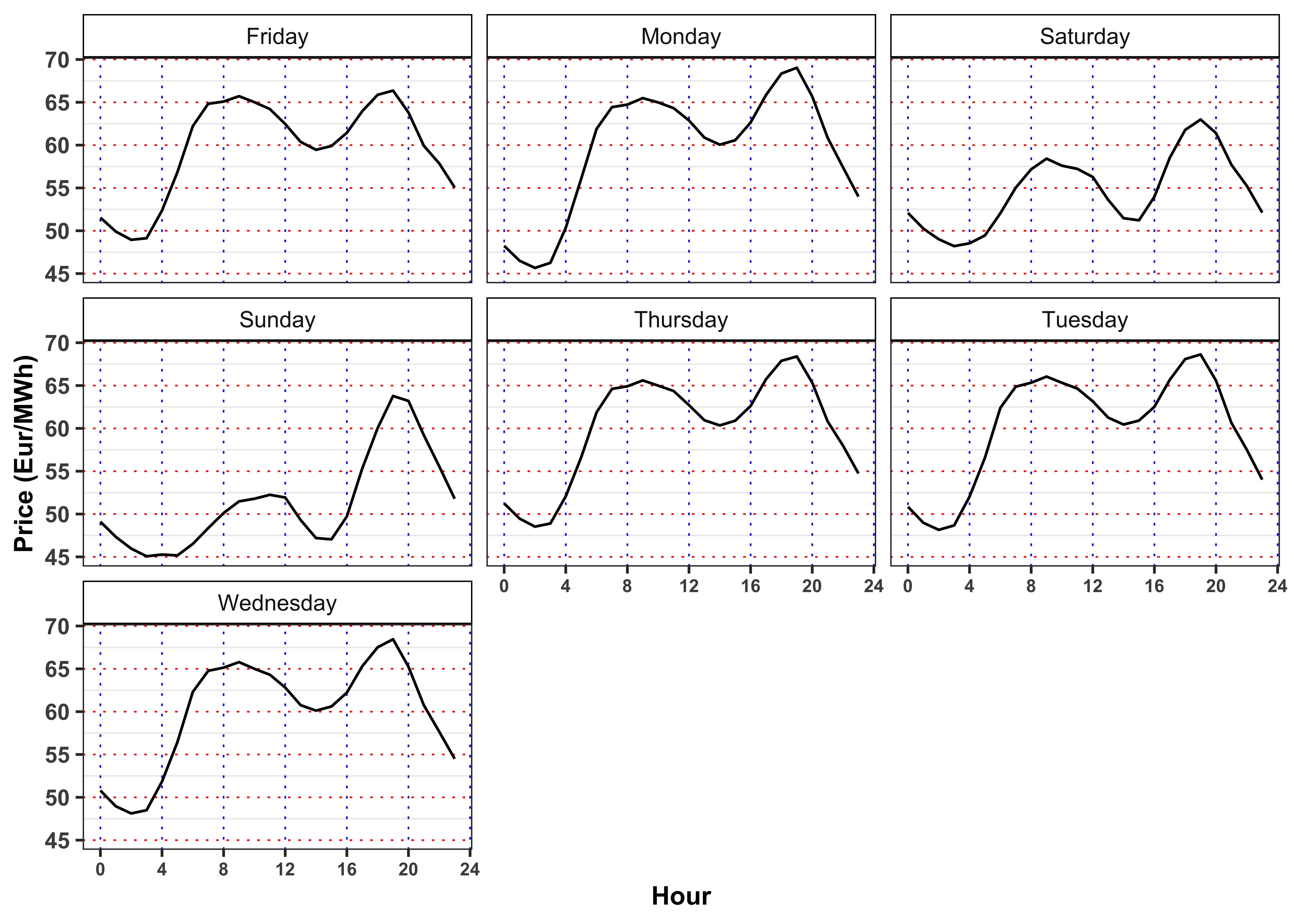
Code
data %>%
  mutate(Month = lubridate::month(date_day, label = TRUE)) %>%
  group_by(Month, Hour) %>%
  summarise(price = mean(price, na.rm = TRUE)) %>%
  ggplot()+
  geom_line(aes(Hour, price), color = "black")+
  facet_wrap(~Month)+
  theme_bw()+
  custom_theme+
  scale_x_continuous(breaks = seq(0, 24, 4))+
  scale_y_continuous(breaks = seq(0, 100, 5),
                     labels = seq(0, 100, 5))+
  labs(color = NULL, y = "Price (Eur/MWh)")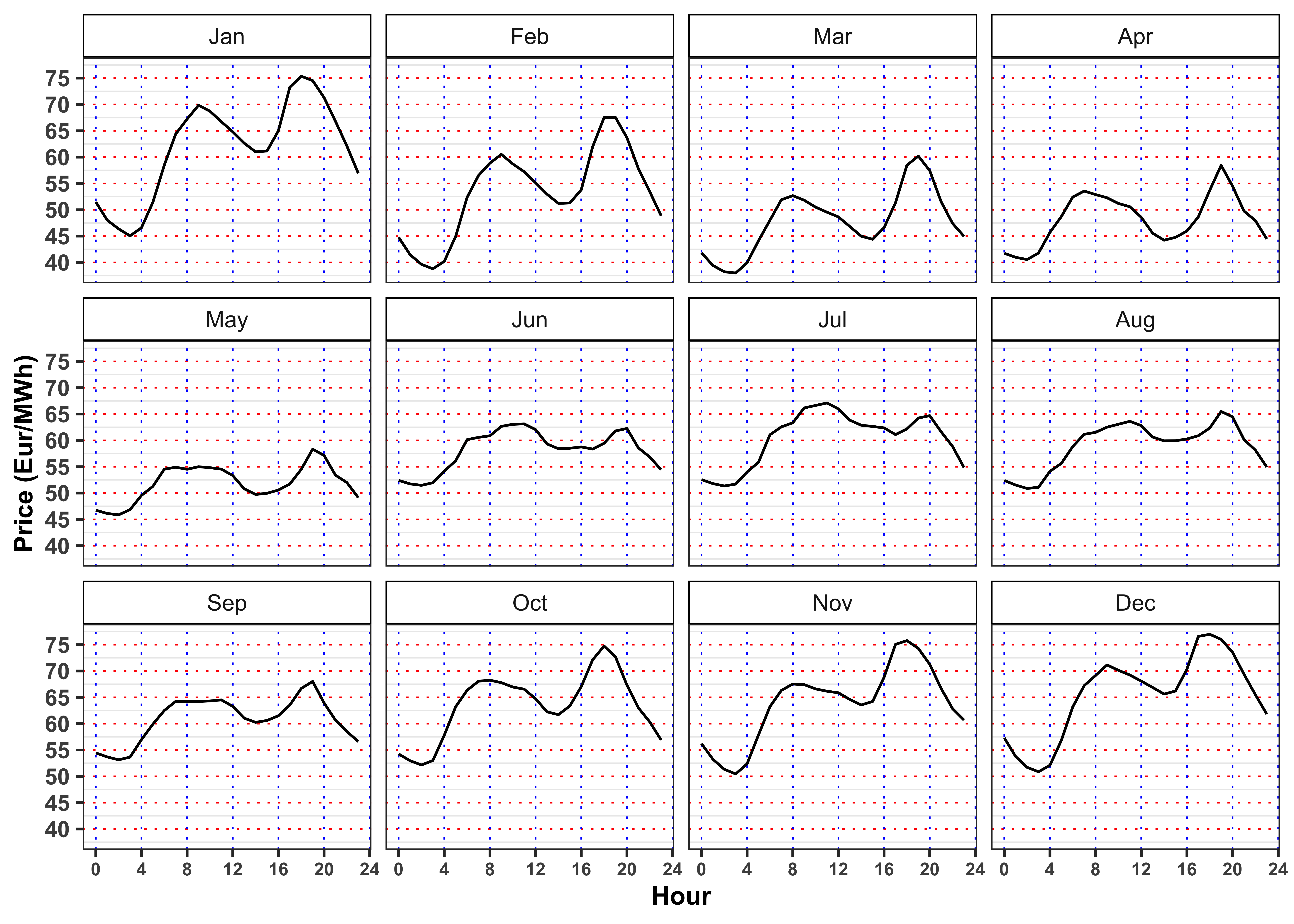
Code
data %>%
  group_by(Season, Hour) %>%
  summarise(price = mean(price, na.rm = TRUE)) %>%
  ggplot()+
  geom_line(aes(Hour, price))+
  geom_point(aes(Hour, price))+
  facet_wrap(~Season)+
  theme_bw()+
  custom_theme+
  scale_x_continuous(breaks = seq(0, 24, 2))+
  scale_y_continuous(breaks = seq(0, 100, 10))+
  labs(color = NULL, y = "Price (Eur/MWh)")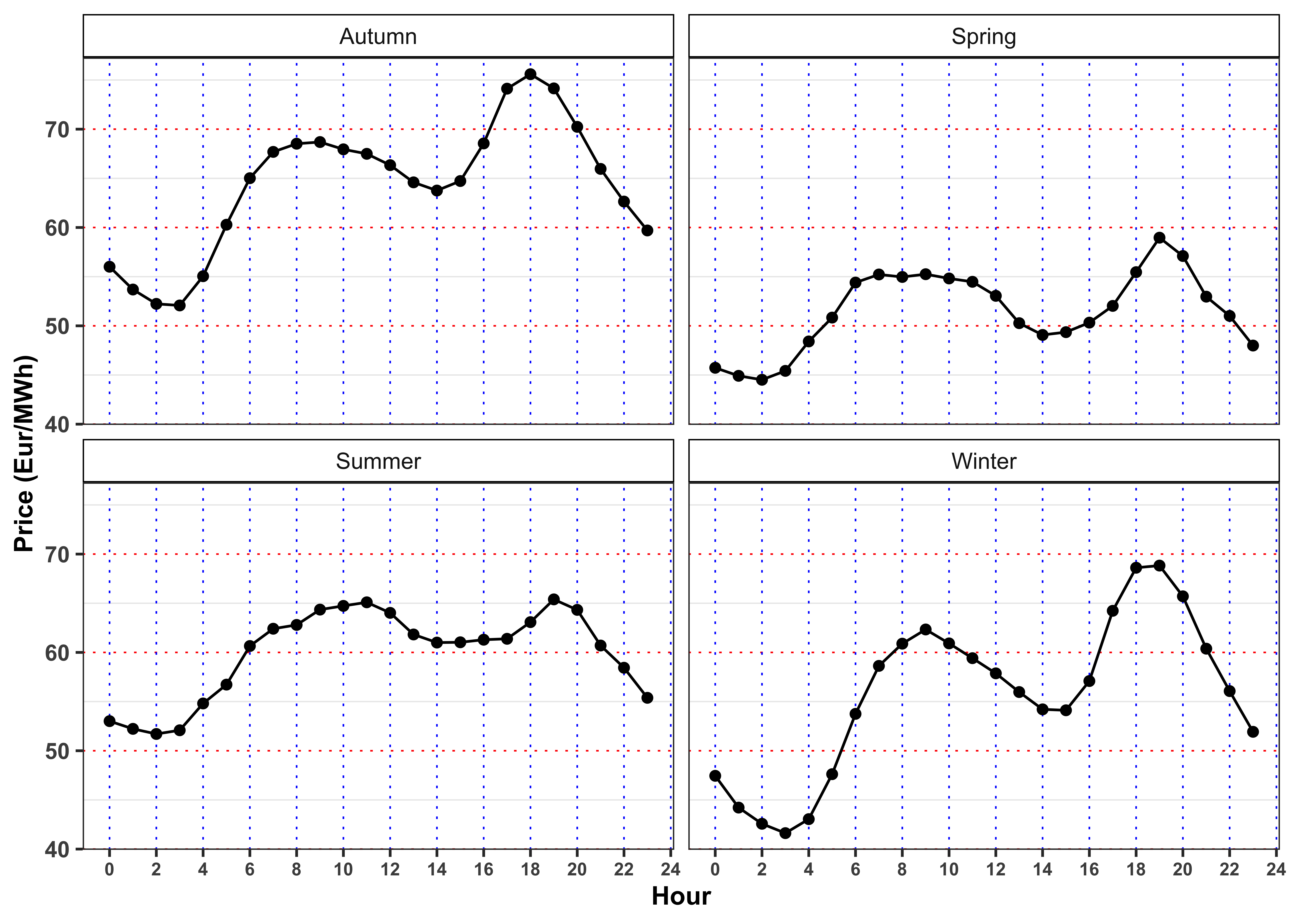
4 Part B: Model daily electricity price
4.1 Task B.1
Let’s aggregate the data on a daily basis by computing the daily average electricity prices.
Daily Aggregation
# Daily prices
data_prices <- data %>%
  mutate(date = date_day) %>%
  group_by(date, Year, Month, Day) %>%
  summarise(price = mean(price), Season = unique(Season)) %>%
  ungroup() %>%
  mutate(log_price = log(price),
         Weekday = weekdays(date))

# Prepare the seasonal variables
# Day of the week
levels_weekday <- c("Monday", "Tuesday", "Wednesday", "Thursday", "Friday", "Saturday", "Sunday")
data_prices$Weekday_ <- factor(data_prices$Weekday, levels = levels_weekday, labels = levels_weekday)
# Months
levels_month <- c("January", "February", "March", "April",
                  "May", "June", "July", "August",
                  "September", "October", "November", "December")
data_prices$Month_ <- factor(data_prices$Month, levels = 1:12, labels = levels_month)
# Seasons
levels_season <- c("Winter", "Spring", "Summer", "Autumn")
data_prices$Season_ <- factor(data_prices$Season, levels = levels_season, labels = levels_season)
4.1.1 Task B.1 (a)
Let’s consider only positive prices \(P_t\) for electricity, hence we transform them into the corresponding log-prices \(S_t\), i.e. \[ S_t = \log(P_t) \iff P_t = \exp(S_t) \text{.} \tag{5}\] Then, we can proceed by removing the seasonality from the time series. Let’s define a seasonal function to remove deterministic components from the month, day of the week, i.e. \[ \bar{S}_t = s_0 + D(t) + M(t) + S(t) \text{,} \] where \(D(t)\), \(M(t)\) and \(S(t)\) stands for the indicator functions \[ \begin{aligned} D(t) = \begin{cases} D_2 \quad \ \text{Tuesday} \\ \vdots \\ D_{7} \quad \text{Sunday} \\ \end{cases} \quad M(t) = \begin{cases} M_2 \quad \ \text{February} \\ \vdots \\ M_{12} \quad \text{December} \\ \end{cases} \quad S(t) = \begin{cases} S_{2} \quad \ \text{Spring} \\ S_{3} \quad \ \text{Summer} \\ S_{4} \quad \text{Autumn} \\ \end{cases} \end{aligned} \tag{6}\] It follows that, by construction, the intercept \(s_0\) is interpreted as the average log price when the day is Monday, the month is January and the season is Spring. Estimate the parameters of the model with Ordinary Least Square, then compute the seasonal price \(\bar{S}_t\) and the deseasonalized time series, i.e. \[ \tilde{S}_t = S_t - \bar{S}_t \text{.} \]
Fit the seasonal model
# Seasonal model
seasonal_model <- lm(log_price ~ Month_ + Weekday_ + Season_, data = data_prices)
# Predicted seasonal mean
data_prices$log_price_bar <- predict(seasonal_model, newdata = data_prices)
# Fitted residuals
data_prices$log_price_tilde <- data_prices$log_price - data_prices$log_price_bar
Table statistics.
| r.squared | adj.r.squared | sigma | statistic | p.value | df | logLik | AIC | BIC | deviance | df.residual | nobs |
|---|---|---|---|---|---|---|---|---|---|---|---|
| 0.2953 | 0.2855 | 0.2061 | 30.1916 | 0 | 20 | 245.3127 | -446.6255 | -330.2991 | 61.197 | 1441 | 1462 |
Table estimates.
| term | estimate | std.error | statistic | p.value |
|---|---|---|---|---|
| (Intercept) | 4.1173 | 0.0227 | 181.2863 | 0.0000 |
| Month_February | -0.1517 | 0.0268 | -5.6618 | 0.0000 |
| Month_March | -0.2391 | 0.0281 | -8.4973 | 0.0000 |
| Month_April | -0.1988 | 0.0443 | -4.4906 | 0.0000 |
| Month_May | -0.1290 | 0.0441 | -2.9238 | 0.0035 |
| Month_June | -0.0103 | 0.0427 | -0.2404 | 0.8101 |
| Month_July | -0.0203 | 0.0491 | -0.4139 | 0.6790 |
| Month_August | -0.0463 | 0.0491 | -0.9415 | 0.3466 |
| Month_September | -0.0303 | 0.0451 | -0.6710 | 0.5023 |
| Month_October | -0.0204 | 0.0439 | -0.4646 | 0.6423 |
| Month_November | -0.0165 | 0.0441 | -0.3733 | 0.7089 |
| Month_December | 0.0303 | 0.0361 | 0.8390 | 0.4016 |
| Weekday_Tuesday | 0.0141 | 0.0202 | 0.6997 | 0.4842 |
| Weekday_Wednesday | 0.0098 | 0.0202 | 0.4836 | 0.6288 |
| Weekday_Thursday | 0.0135 | 0.0202 | 0.6678 | 0.5044 |
| Weekday_Friday | 0.0038 | 0.0202 | 0.1882 | 0.8507 |
| Weekday_Saturday | -0.0936 | 0.0202 | -4.6430 | 0.0000 |
| Weekday_Sunday | -0.1654 | 0.0202 | -8.2057 | 0.0000 |
| Season_Spring | -0.0435 | 0.0355 | -1.2226 | 0.2217 |
| Season_Summer | 0.0230 | 0.0416 | 0.5523 | 0.5808 |
| Season_Autumn | 0.0805 | 0.0353 | 2.2808 | 0.0227 |
4.1.2 Task B.1 (b)
Plot the log-prices \(S_t\), the deseasonalized log-prices \(\tilde{S}_t\) and the estimated seasonal function \(\bar{S}_t\) for 2017.
Figure deseasonalized series.
# Plot year
plot_year <- 2017
# Plot realized, seasonal function and deseasonalized prices for `plot_year`
plot_seasonal <- data_prices %>%
  filter(Year == plot_year)%>%
  ggplot()+
  geom_point(aes(date, log_price_tilde, color = "realized"), alpha = 0)+
  geom_line(aes(date, log_price, color = "sample"))+
  geom_line(aes(date, log_price_tilde, color = "deseasonal"))+
  geom_line(aes(date, log_price_bar, color = "seasonal"))+
  geom_line(aes(date, 0, color = "realized"), alpha = 0)+
  labs(x = NULL, y = latex2exp::TeX("$P_t$"), color = NULL)+
  scale_color_manual(values = c(sample = "orange", realized = "black",
                                seasonal = "blue", deseasonal = "black"),
                     labels = c(sample = "Sample", realized = "Realized residuals",
                                seasonal = "Seasonal", deseasonal = "Deseasonalized"))+
  theme_bw()+
  custom_theme+
  theme(legend.position = "top")

# Plot realized deseasonalized prices for all the data
plot_eps <- data_prices %>%
  mutate(type = ifelse(Year == plot_year, "col", "nocol")) %>%
  ggplot()+
  geom_point(aes(date, log_price_tilde, color = type), size = 0.05)+
  labs(x = NULL, y = latex2exp::TeX("$\\tilde{P}_t$"), color = NULL)+
  scale_color_manual(values = c(col = "orange", nocol = "black"))+
  custom_theme+
  theme_bw()+
  theme(legend.position = "none")
gridExtra::grid.arrange(plot_seasonal, plot_eps, ncol = 1, heights = c(0.6, 0.4))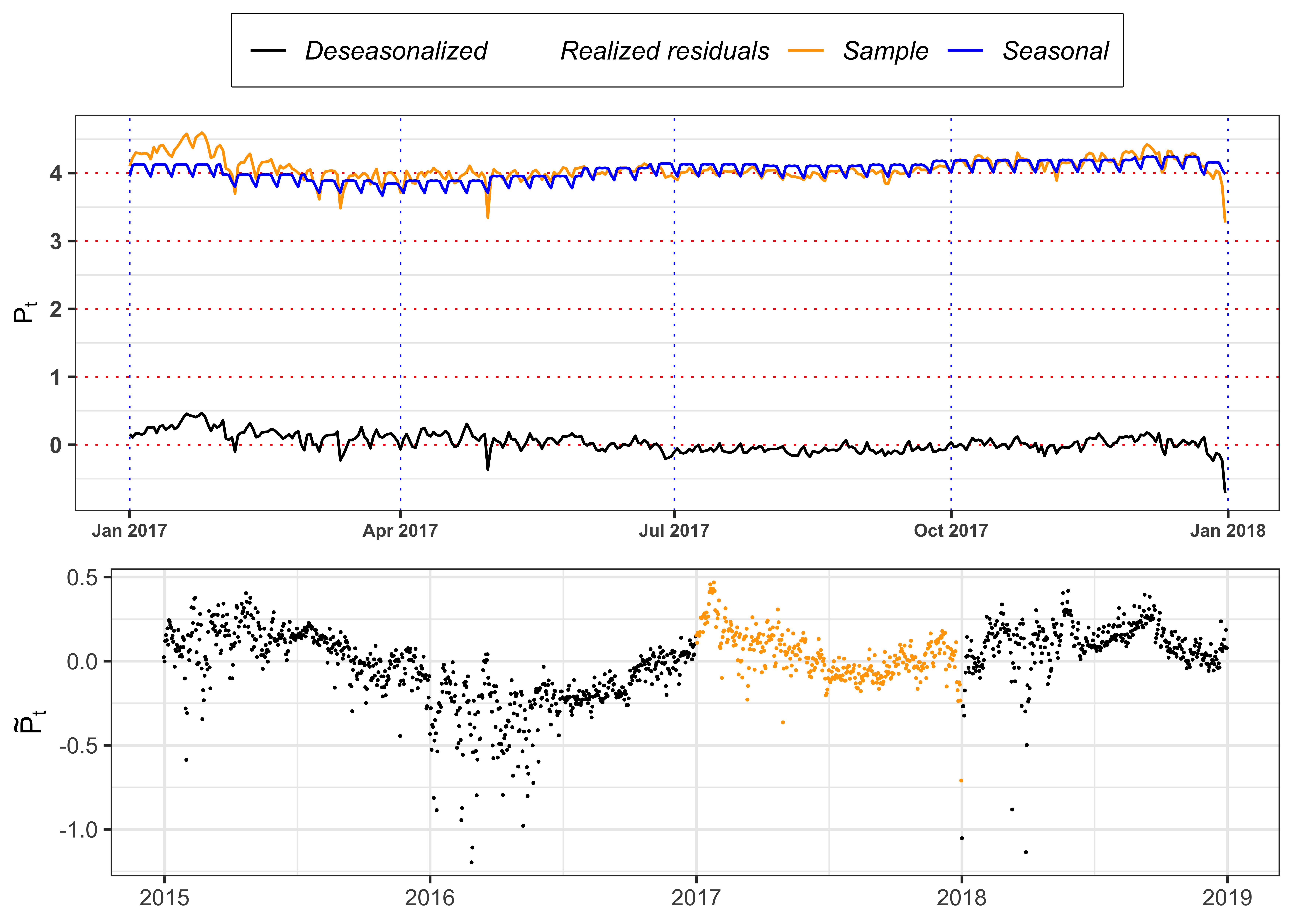
4.1.3 Task B.1 (c)
Plot the autocorrelation function for the deseasonalized log-prices \(\tilde{S}_t\) and for the squared deseasonalized log-prices \(\tilde{S}_t^2\) and their confidence intervals with \(\alpha = 0.05\). Is the time series of \(\tilde{S}_t\) uncorrelated?
Figure autocorrelation.
# Maximum number of lags
lag.max <- 365
# Confidence level
ci <- 0.05
# ACF log price tilde
acf_x <- acf(data_prices$log_price_tilde, type = "correlation", plot = FALSE, lag.max = lag.max)$acf[,,1][-1]
# ACF log price tilde squared
acf_x2 <- acf(data_prices$log_price_tilde^2, type = "correlation", plot = FALSE, lag.max = lag.max)$acf[,,1][-1]
# Limits for y-axis
limits_y <- range(c(acf_x, acf_x2))
# Confidence levels
acf_ci_bound <- qnorm(1 - ci / 2) / sqrt(nrow(data_prices))
plot_acf_x <- ggplot()+
  geom_bar(aes(1:lag.max, acf_x), stat = "identity", width = 1)+
  geom_line(aes(1:lag.max, acf_ci_bound), color = "blue", linetype = "dashed")+
  geom_line(aes(1:lag.max, -acf_ci_bound), color = "blue", linetype = "dashed")+
  scale_y_continuous(limits = limits_y)+
  labs(x = NULL, y = latex2exp::TeX("ACF($\\tilde{P}_t$)"), color = NULL)+
  theme_bw()+
  custom_theme+
  theme(legend.position = "none")

plot_acf_x2 <-ggplot()+
  geom_bar(aes(1:lag.max, acf_x2), stat = "identity", width = 1)+
  geom_line(aes(1:lag.max, acf_ci_bound), color = "blue", linetype = "dashed")+
  geom_line(aes(1:lag.max, -acf_ci_bound), color = "blue", linetype = "dashed")+
  scale_y_continuous(limits = limits_y)+
  labs(x = "Lags", y = latex2exp::TeX("ACF($\\tilde{P}_t^2$)"), color = NULL)+
  theme_bw()+
  custom_theme+
  theme(legend.position = "none")

gridExtra::grid.arrange(plot_acf_x, plot_acf_x2, ncol = 1)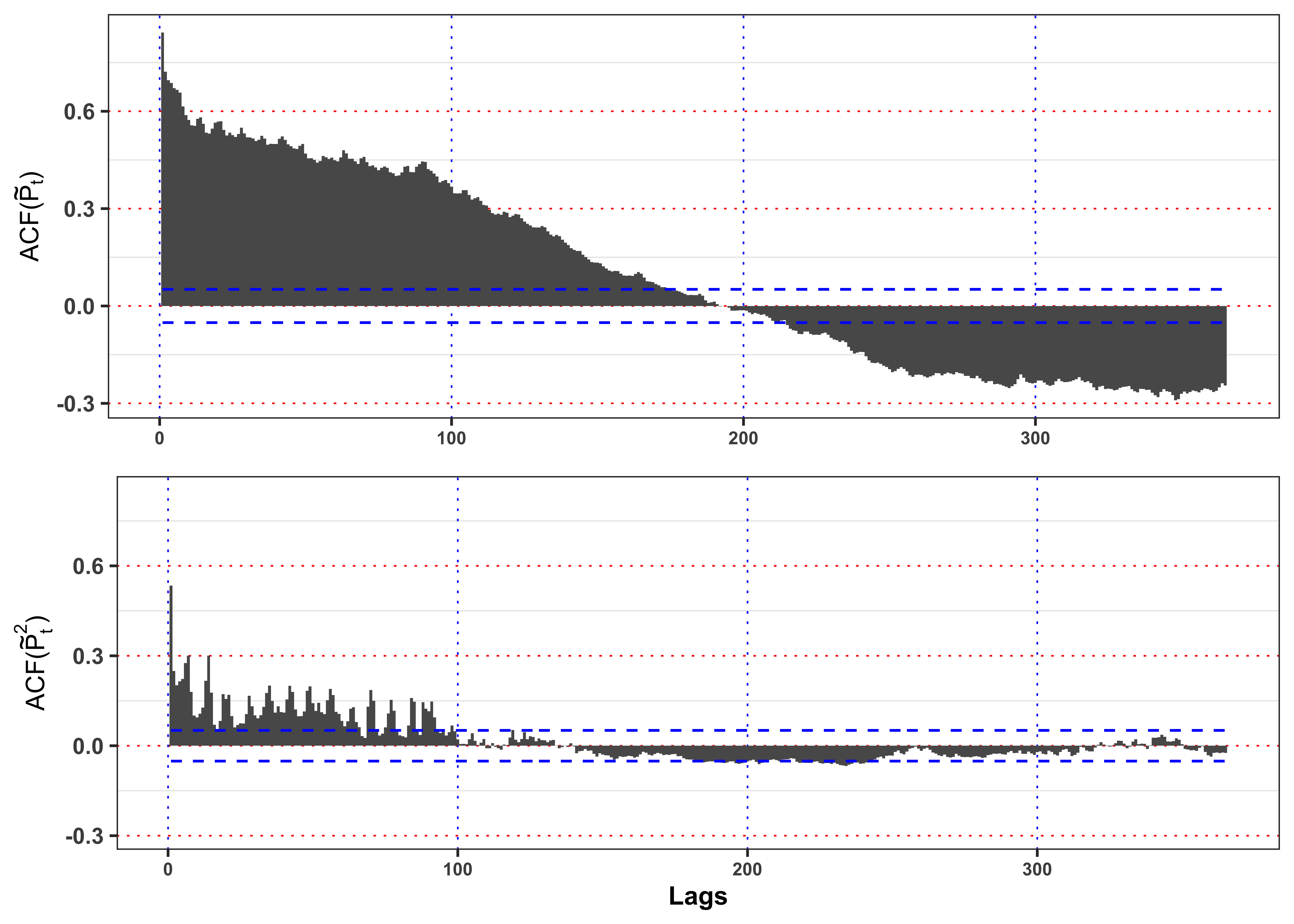
4.2 Task B.2
The deseasonalized log-prices presents a strong autocorrelation in mean and variance. Let’s proceed by removing the first and then we will deal with the second. A popular model for electricity prices is the Autoregressive model of order 1 (AR(1)), the correspondent discrete version of an OU-process.
4.2.1 Task B.2 (a)
Test the hypothesis that the deseasonalized log-prices follows a random walk with an appropriate test. For example, you can consider an Augmented Dickey-Fuller Test. Fit with OLS an AR(1) model of the form \[ \tilde{S}_t = \phi \tilde{S}_{t-1} + \varepsilon_t \text{.} \] where we refer to this section for more details. Then, compute the fitted residuals \[ \varepsilon_t = \tilde{S}_t - \phi \tilde{S}_{t-1} \text{,} \tag{7}\] their standard deviation \[ \sigma_{\varepsilon} = \sqrt{\frac{1}{n-1}\sum_{t = 1}^n \varepsilon_t^2} \text{,} \tag{8}\] and the standardized residuals \[ \tilde{\varepsilon}_t = \frac{\varepsilon_t}{\sigma_{\varepsilon}} \text{.} \tag{9}\] Is the estimated model stationary?
Table ADF Test.
tseries::adf.test(data_prices$log_price_tilde, k = 7, alternative = "stationary") %>%
  broom::tidy() %>%
  dplyr::select(-alternative) %>%
  dplyr::mutate(lags = 20,
         H0 = ifelse(p.value <= 0.01, "Rejected (stationary)", "Non-rejected (explosive)")) %>%
  dplyr::mutate_if(is.numeric, format, digits = 4, scientific = FALSE) %>%
  knitr::kable(booktabs = TRUE, escape = FALSE, align = 'c') %>%
kableExtra::row_spec(0, color = "white", background = "green") | statistic | p.value | parameter | method | lags | H0 |
|---|---|---|---|---|---|
| -5.151 | 0.01 | 7 | Augmented Dickey-Fuller Test | 20 | Rejected (stationary) |
AR model on the deseasonalized log-prices.
# AR model
AR_model <- lm(log_price_tilde ~ I(dplyr::lag(log_price_tilde, 1)) - 1, data = data_prices)
# Fitted values
data_prices$log_price_tilde_hat <- predict(AR_model, newdata = data_prices)
# Fitted residuals
data_prices$eps <- data_prices$log_price_tilde - data_prices$log_price_tilde_hat
# Estimated constant standard deviation
data_prices$sigma_bar <- sd(data_prices$eps, na.rm = TRUE)*sqrt(nrow(data_prices)/(nrow(data_prices)-1))
# Standardized residuals
data_prices$std_eps <- data_prices$eps/data_prices$sigma_bar
data_prices <- data_prices[-c(1),]
Table statistics.
glance_AR_model <- broom::glance(AR_model)
glance_AR_model %>%
  dplyr::select(-df, -logLik, -AIC, -BIC) %>%
  dplyr::mutate_if(is.numeric, format, digits = 4, scientific = FALSE) %>%
  knitr::kable(booktabs = TRUE, escape = FALSE, align = 'c') %>%
kableExtra::row_spec(0, color = "white", background = "green") | r.squared | adj.r.squared | sigma | statistic | p.value | deviance | df.residual | nobs |
|---|---|---|---|---|---|---|---|
| 0.7105 | 0.7103 | 0.1102 | 3583 | 0 | 17.72 | 1460 | 1461 |
Table estimates.
| term | estimate | std.error | statistic | p.value |
|---|---|---|---|---|
| $$\phi$$ | 0.8429 | 0.01408 | 59.86 | 0 |
Note that, since \(\phi =\) 0.843 is less than 1 in absolute value, then the AR(1) model is stationary.
4.2.2 Task B.2 (b)
Plot the autocorrelation function of standardized residuals \(\tilde{\varepsilon}_t\), the squared standardized residuals \(\tilde{\varepsilon}_t^2\) and their confidence intervals with \(\alpha = 0.05\). Then, let’s verify if the basic assumptions of the model hold.
- Assumption 1.: Identically distributed residuals. We can verify this hypothesis with a two-sample Kolmogorov test. (see here)
Hint: For the two-sample Kolmogorov test you can consider the following R function.
Two-sample Kolmogorov Smirnov Test
#' Kolmogorov Smirnov test for a distribution
#'
#' Test against a specific distribution
#'
#' @param x a vector.
#' @param ci p.value for rejection.
#' @param idx_split Index used for splitting the time series. If `missing` will be random sampled.
#' @param min_quantile minimum quantile for the grid of values.
#' @param max_quantile maximum quantile for the grid of values.
#' @param seed random seed for two sample test.
#' @param plot when `TRUE` a plot is returned, otherwise a `tibble`.
#' @return when `plot = TRUE` a plot is returned, otherwise a `tibble`.
ks_test_ts <- function(x, ci = 0.05, idx_split, min_quantile = 0.015, max_quantile = 0.985, seed = 1, plot = FALSE){
  # Random seed
  set.seed(seed)
  # number of observations
  n <- length(x)
  # Random split of the time series
  idx_split <- ifelse(missing(idx_split), sample(n, 1), idx_split)
  x1 <- x[1:idx_split]
  x2 <- x[(idx_split+1):n]
  # Number of elements for each sub sample
  n1 <- length(x1)
  n2 <- length(x2)
  # Grid of values for KS-statistic
  grid <- seq(quantile(x, min_quantile), quantile(x, max_quantile), 0.01)
  # Empiric cdfs
  cdf_n1 <- ecdf(x1)
  cdf_n2 <- ecdf(x2)
  # KS-statistic
  ks_stat <- max(abs(cdf_n1(grid) - cdf_n2(grid)))
  # Rejection level
  # Equivalent: sqrt(-log(ci / 2) * (1 + n2/n1) / (2*n2))
  rejection_lev <- sqrt(-0.5 * log(ci / 2)) * sqrt((n1+n2)/(n1*n2))
  # P-value
  p.value <- 2 * exp(- 2 * n2 / (1 + n1/n2) * ks_stat^2)

  # ========================== Plot ==========================
  if (plot) {
    y_breaks <- seq(0, 1, 0.2)
    y_labels <- paste0(format(y_breaks*100, digits = 2), "%")
    grid_max <- grid[which.max(abs(cdf_n1(grid) - cdf_n2(grid)))]
    plt <- ggplot()+
      geom_ribbon(aes(grid, ymax = cdf_n1(grid), ymin = cdf_n2(grid)),
                  alpha = 0.5, fill = "green") +
      geom_line(aes(grid, cdf_n1(grid)))+
      geom_line(aes(grid, cdf_n2(grid)), color = "red")+
      geom_segment(aes(x = grid_max, xend = grid_max,
                       y = cdf_n1(grid_max), yend = cdf_n2(grid_max)),
                   linetype = "solid", color = "magenta")+
      geom_point(aes(grid_max, cdf_n1(grid_max)), color = "magenta")+
      geom_point(aes(grid_max, cdf_n2(grid_max)), color = "magenta")+
      scale_y_continuous(breaks = y_breaks, labels = y_labels)+
      labs(x = "x", y = "cdf")+
      theme_bw()
    return(plt)
  } else {
    kab <- dplyr::tibble(
      idx_split = idx_split,
      ci = paste0(ci*100, "%"),
      n1 = n1,
      n2 = n2,
      KS = ks_stat,
      p.value = p.value,
      rejection_lev = rejection_lev,
      H0 = ifelse(KS > rejection_lev, "Rejected", "Non-Rejected")
    )
    class(kab) <- c("ks_test_ts", class(kab))
    return(kab)
  }
}- Assumption 2.: Uncorrelated residuals. If we do not reject Assumption 1. we can use Box-cox test, however if we reject Assumption 1. the Box-Cox tests are not valid and it is better to rely on a more general approach. In general, we can fit an AR(p) mode on the standardized residuals, i.e.
\[ \tilde{\varepsilon}_t \sim a_0 + a_1 \tilde{\varepsilon}_{t-1} + \dots + a_p \tilde{\varepsilon}_{t-p} + z_t \text{,} \] and test for the significance of the entire regression with the F-test. More precisely, the F-statistic and its p-value are evaluated under the null hypothesis \[ H_0 = a_1 = \dots = a_p = 0 \implies \tilde{\varepsilon}_t = a_0 + z_t \text{.} \] In other words, under \(H_0\) the standardized residuals are uncorrelated and with expectation equal to \(a_0\). Is the AR model able to remove the autocorrelation in mean? Are the standardized residuals stationary in variance?
Figure autocorrelation.
# Maximum number of lags
lag.max <- 365
# Confidence level
ci <- 0.05
# ACF log price tilde
acf_x <- acf(data_prices$std_eps, type = "correlation", plot = FALSE, lag.max = lag.max)$acf[,,1][-1]
# ACF log price tilde squared
acf_x2 <- acf(data_prices$std_eps^2, type = "correlation", plot = FALSE, lag.max = lag.max)$acf[,,1][-1]
# Limits for y-axis
limits_y <- range(c(acf_x, acf_x2))
# Confidence levels
acf_ci_bound <- qnorm(1 - ci / 2) / sqrt(nrow(data_prices))
plot_acf_x <- ggplot()+
  geom_bar(aes(1:lag.max, acf_x), stat = "identity", width = 1)+
  geom_line(aes(1:lag.max, acf_ci_bound), color = "blue", linetype = "dashed")+
  geom_line(aes(1:lag.max, -acf_ci_bound), color = "blue", linetype = "dashed")+
  scale_y_continuous(limits = limits_y)+
  labs(x = NULL, y = latex2exp::TeX("ACF($\\tilde{P}_t$)"), color = NULL)+
  theme_bw()+
  custom_theme+
  theme(legend.position = "none")
plot_acf_x2 <-ggplot()+
  geom_bar(aes(1:lag.max, acf_x2), stat = "identity", width = 1)+
  geom_line(aes(1:lag.max, acf_ci_bound), color = "blue", linetype = "dashed")+
  geom_line(aes(1:lag.max, -acf_ci_bound), color = "blue", linetype = "dashed")+
  scale_y_continuous(limits = limits_y)+
  labs(x = "Lags", y = latex2exp::TeX("ACF($\\tilde{P}_t^2$)"), color = NULL)+
  theme_bw()+
  custom_theme+
  theme(legend.position = "none")

gridExtra::grid.arrange(plot_acf_x, plot_acf_x2, ncol = 1)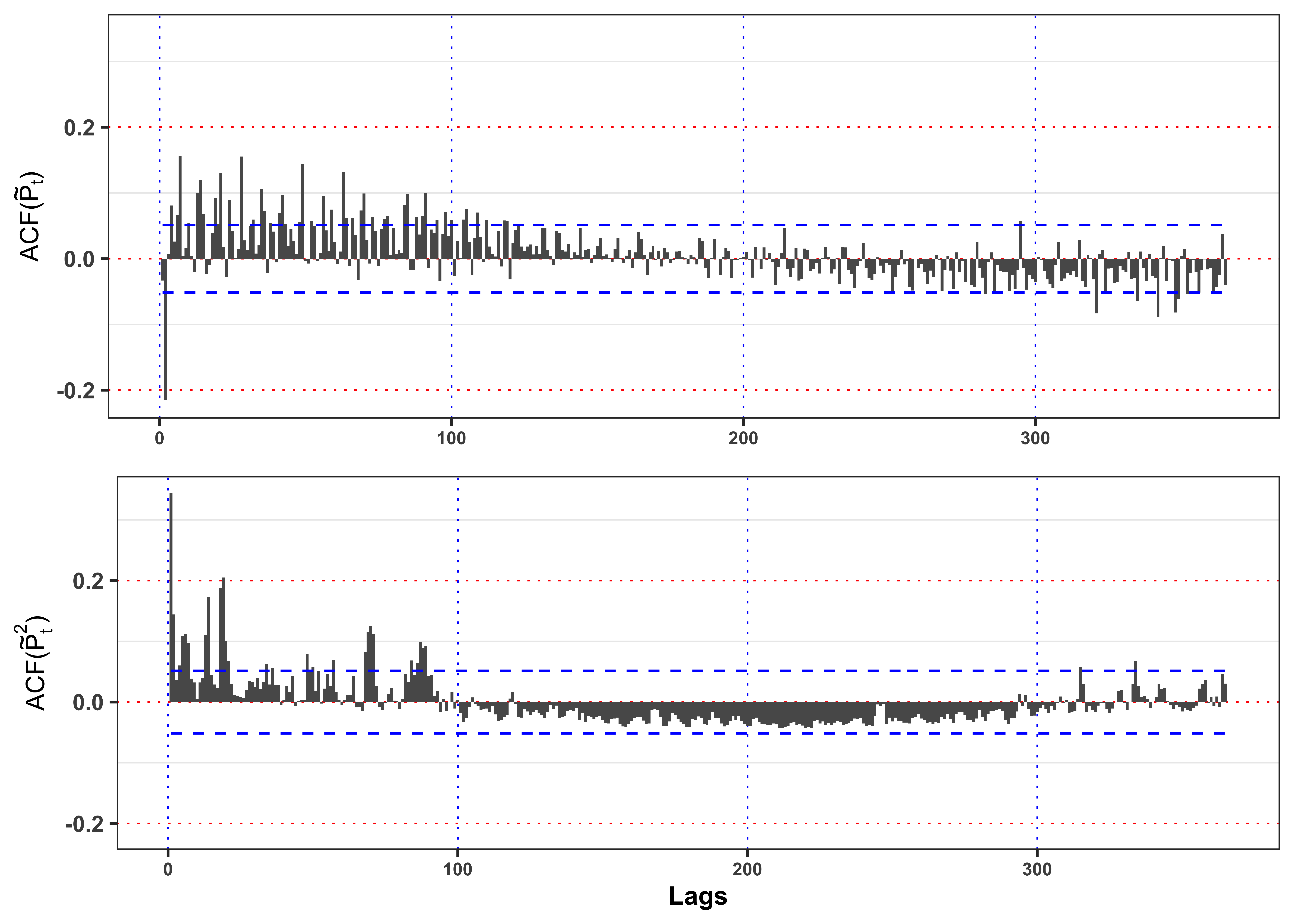
As shown in Figure 11 the residuals present a significant autocorrelation in mean and variance that will make them not identically distributed and correlated.
Figure residuals.
plot_eps <- ggplot(data_prices)+
  geom_point(aes(date, eps), color = "black", size = 0.1, alpha = 0.4)+
  geom_line(aes(date, 3*sigma_bar, color = "sigma3"), size = 0.4)+
  geom_line(aes(date, 2*sigma_bar, color = "sigma2"), size = 0.4)+
  geom_line(aes(date, 1*sigma_bar, color = "sigma1"), size = 0.4)+
  geom_line(aes(date, -1*sigma_bar, color = "sigma1"), size = 0.4)+
  geom_line(aes(date, -2*sigma_bar, color = "sigma2"), size = 0.4)+
  geom_line(aes(date, -3*sigma_bar, color = "sigma3"), size = 0.4)+
  labs(x = NULL, y = TeX("$\\epsilon_t$"), color = NULL)+
  theme_bw()+
  theme(legend.position = "top")+
  theme_bw()+
  custom_theme+
  scale_color_manual(values = c(sigma1 = "green", sigma2 = "orange", sigma3 = "red", std_eps = "darkorange"),
                     labels = c(sigma1 = TeX("$\\pm \\bar{\\sigma}$"),
                                sigma2 = TeX("$\\pm 2\\bar{\\sigma}$"),
                                sigma3 = TeX("$\\pm 3\\bar{\\sigma}$"),
                                std_eps = TeX("$\\bar{\\epsilon}_t = \\frac{\\epsilon_t}{\\bar{\\sigma}}$")))
plot_std_eps <- ggplot(data_prices)+
  geom_point(aes(date, std_eps), color = "black", size = 0.1, alpha = 0.4)+
  geom_line(aes(date, 3, color = "sigma3"), size = 0.4)+
  geom_line(aes(date, 2, color = "sigma2"), size = 0.4)+
  geom_line(aes(date, 1, color = "sigma1"), size = 0.4)+
  geom_line(aes(date, -1, color = "sigma1"), size = 0.4)+
  geom_line(aes(date, -2, color = "sigma2"), size = 0.4)+
  geom_line(aes(date, -3, color = "sigma3"), size = 0.4)+
  labs(x = NULL, y = TeX("$\\bar{\\epsilon}_t$"), color = NULL)+
  scale_color_manual(values = c(sigma1 = "green", sigma2 = "orange", sigma3 = "red"))+
  theme_bw()+
  custom_theme+
  theme(legend.position = "none")

gridExtra::grid.arrange(plot_eps, plot_std_eps, ncol = 1, heights = c(0.6, 0.4))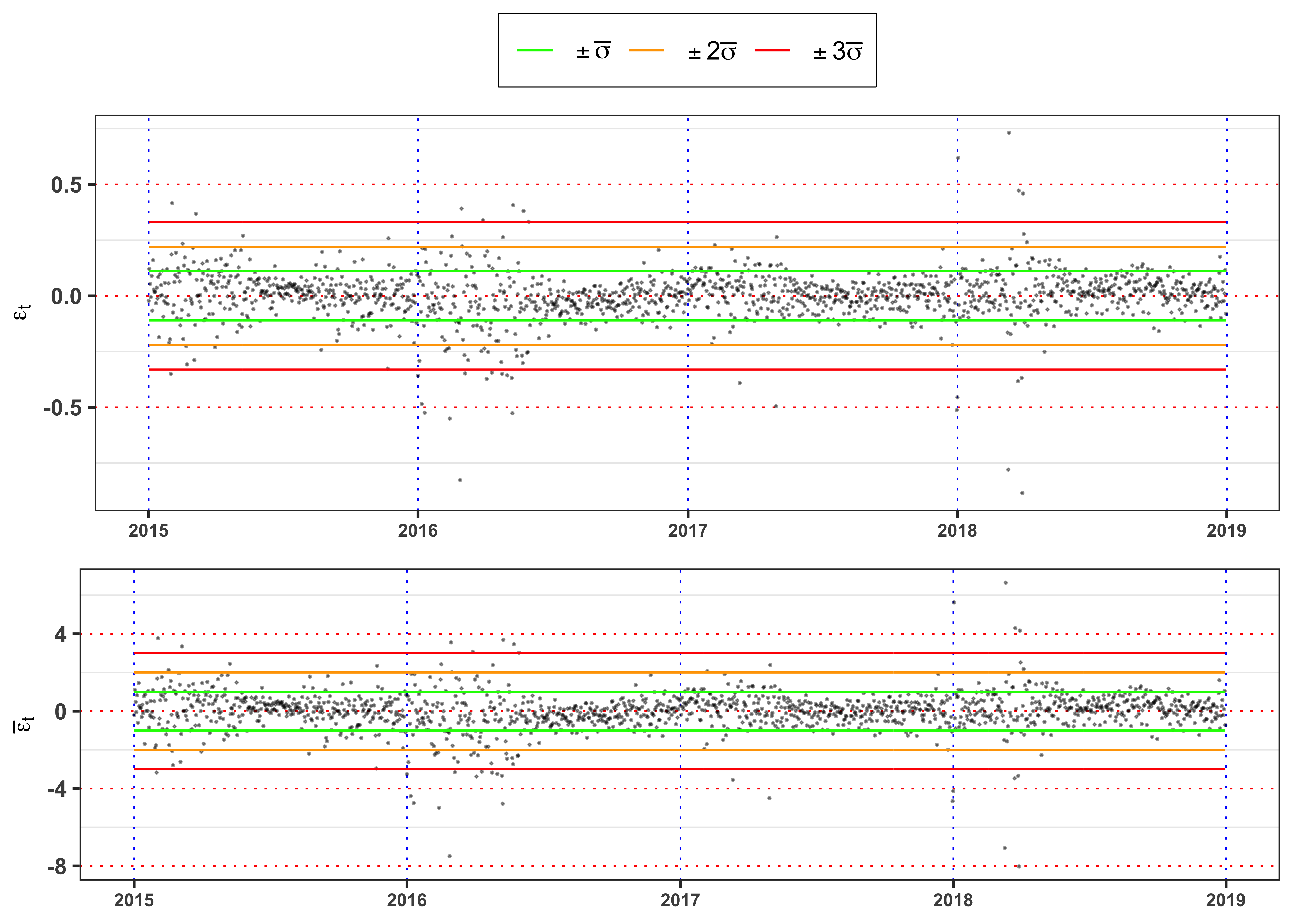
The Figure 12 shows clearly that the standardized residuals presents volatility clusters, hence the time series of \(\bar{\epsilon}_t\) cannot be identically distributed. A formal way to test it, is a two sample Kolmogorov-Smirnov test.
KS-test on \(\tilde{\varepsilon}_t\)
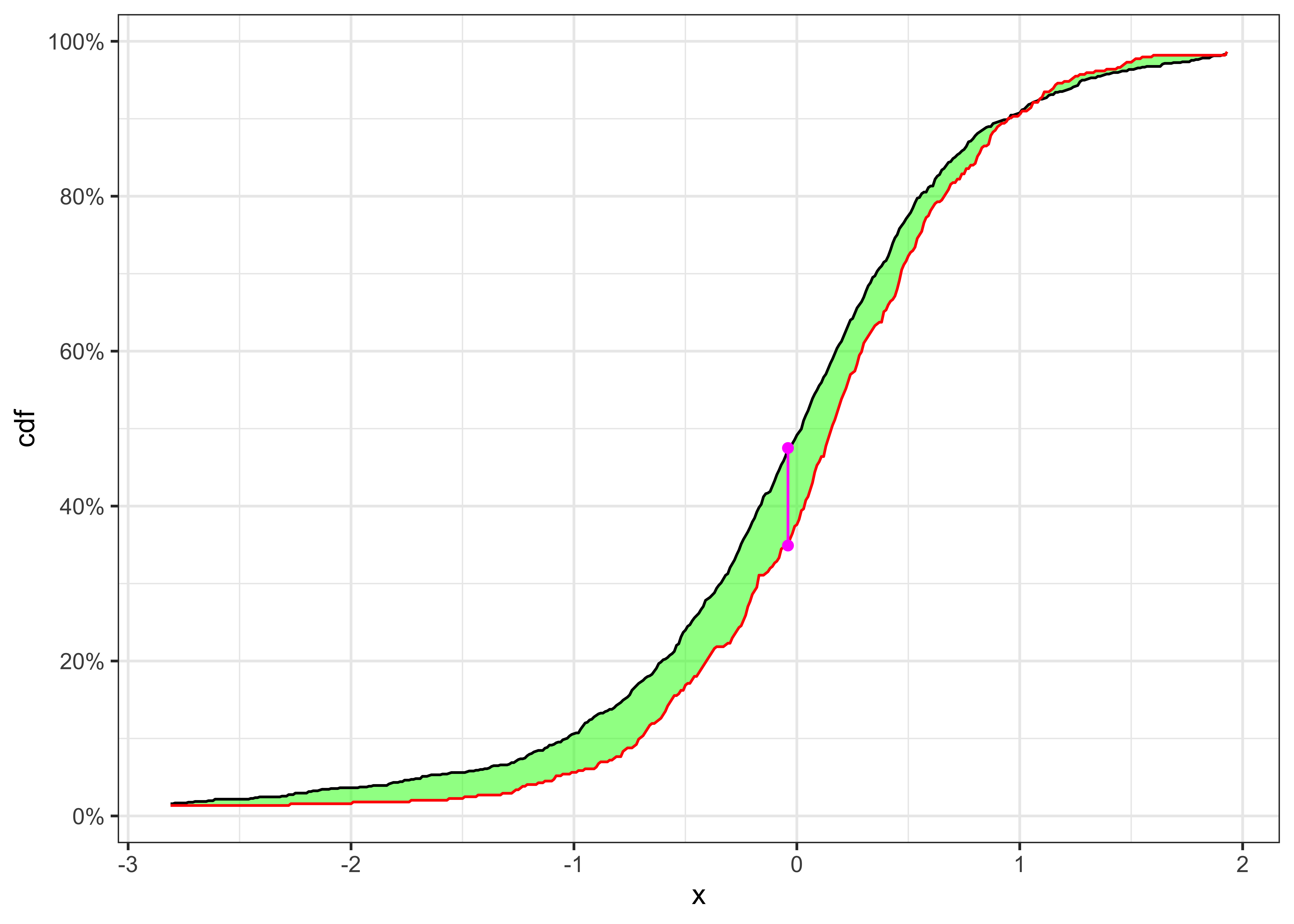
Two samples cdfs and KS-statistics for \(\tilde{\varepsilon}_t\).
kab <- ks_test_ts(na.omit(data_prices$std_eps), ci = 0.01, seed = 2) %>%
  dplyr::mutate_if(is.numeric, format, digits = 4, scientific = FALSE)
colnames(kab) <- c("Index split", "$$\\alpha$$", "$$n_1$$", "$$n_2$$",
                   "$$KS_{n_1, n_2}$$", "p.value", "Critical Level", "$$H_0$$")
knitr::kable(kab, booktabs = TRUE, escape = FALSE, align = 'c') %>%
kableExtra::row_spec(0, color = "white", background = "green") | Index split | $$\alpha$$ | $$n_1$$ | $$n_2$$ | $$KS_{n_1, n_2}$$ | p.value | Critical Level | $$H_0$$ |
|---|---|---|---|---|---|---|---|
| 975 | 1% | 975 | 486 | 0.1179 | 0.02239 | 0.09038 | Rejected |
The null hypothesis of independence and identically distribution is rejected. Hence, we fit an AR(7) model on the standardized residuals.
Autocorrelation Test on \(\tilde{\varepsilon}_t\).
data_test <- data_prices
# Number of lags to test
lag.max <- 7
# Add lagged variables
for(i in 1:lag.max){
  data_test[[paste0("L", i, "_std_eps")]] <- dplyr::lag(data_test$std_eps, i)
}
# Select only relevant variables
data_test <- na.omit(dplyr::select(data_test, contains("std_eps")))
# Fit an AR(p) model
AR_model_test <- lm(std_eps ~ ., data = data_test)
Table statistics.
| r.squared | adj.r.squared | sigma | statistic | p.value | df | deviance | df.residual | nobs |
|---|---|---|---|---|---|---|---|---|
| 0.0929 | 0.0885 | 0.9552 | 21.1498 | 0 | 7 | 1319.286 | 1446 | 1454 |
Table estimates.
tidy_AR_model_test <- broom::tidy(AR_model_test)
tidy_AR_model_test %>%
  dplyr::mutate_if(is.numeric, round, digits = 4) %>%
  dplyr::mutate(term = paste0("$$a_", 0:lag.max, "$$")) %>%
  knitr::kable(booktabs = TRUE, escape = FALSE, align = 'c') %>%
kableExtra::row_spec(0, color = "white", background = "green") | term | estimate | std.error | statistic | p.value |
|---|---|---|---|---|
| $$a_0$$ | -0.0020 | 0.0250 | -0.0780 | 0.9378 |
| $$a_1$$ | -0.0640 | 0.0258 | -2.4789 | 0.0133 |
| $$a_2$$ | -0.2211 | 0.0257 | -8.5932 | 0.0000 |
| $$a_3$$ | -0.0117 | 0.0263 | -0.4456 | 0.6560 |
| $$a_4$$ | 0.0579 | 0.0262 | 2.2065 | 0.0275 |
| $$a_5$$ | 0.0748 | 0.0263 | 2.8465 | 0.0045 |
| $$a_6$$ | 0.1074 | 0.0257 | 4.1791 | 0.0000 |
| $$a_7$$ | 0.1864 | 0.0258 | 7.2225 | 0.0000 |
As we can see the coefficients -0.00195 has a p-value of 0.938 and so it is not statistically different from zero. However, the F-test equal to 21.15 has a p-value equal to 0 so we rejects the null hypothesis that all the AR coefficients are jointly equal to zero. Therefore, it is still present autocorrelation in mean that the AR(1) is not able to capture.
4.2.3 Task B.2 (c)
Let’s consider a more general model by fitting an ARMA(2,2). Such process will have the form: \[
\tilde{S}_t = \phi_1 \tilde{S}_{t-1} + \phi_2 \tilde{S}_{t-2} + \theta_1 \varepsilon_{t-1} + \theta_2 \varepsilon_{t-2} + \varepsilon_t
\text{,}
\] and can be fitted with maximum likelihood and by minimizing the sum the squared residuals. We refer to this section for more details. In this case, we prefer to be agnostic about the true distribution of \(\varepsilon_t\) and use the second method. In R you can consider the function arima(). Compute the fitted residuals as \[
\varepsilon_t = \tilde{S}_t - \phi_1 \tilde{S}_{t-1} - \phi_2 \tilde{S}_{t-2} - \theta_1 \varepsilon_{t-1} - \theta_2 \varepsilon_{t-2}
\text{.}
\tag{10}\] Re-compute the std. deviation as in Equation 8 and the standardized residuals as in Equation 9. Then, repeat the tests of Section 4.2.2 on the new standardized residuals. Is the ARMA model able to remove the autocorrelation in mean? Are the new standardized residuals stationary in variance?
Fit ARMA model.
# 3) ARMA model
ARMA_model <- arima(data_prices$log_price_tilde, order = c(2, 0, 2), include.mean = FALSE)
# Fitted residuals
data_prices$eps <- ARMA_model$residuals
# Fitted time series
data_prices$log_price_tilde_hat <- data_prices$log_price_tilde - data_prices$eps
# Estimated constant standard deviation
data_prices$sigma_bar <- sd(data_prices$eps, na.rm = TRUE) * sqrt(nrow(data_prices) / (nrow(data_prices) - 1))
# Standardized residuals
data_prices$std_eps <- data_prices$eps / data_prices$sigma_bar
data_prices <- data_prices[-c(1:2),]
ARMA statistics.
| sigma | logLik | AIC | BIC | nobs |
|---|---|---|---|---|
| 0.1037 | 1237.005 | -2464.01 | -2437.576 | 1461 |
ARMA estimates.
tidy_ARMA_model <- broom::tidy(ARMA_model)
tidy_ARMA_model %>%
  dplyr::mutate(term = c("$$\\phi_1$$", "$$\\phi_2$$",
                         "$$\\theta_1$$", "$$\\theta_2$$")) %>%
  dplyr::mutate_if(is.numeric, round, digits = 4) %>%
  knitr::kable(booktabs = TRUE, escape = TRUE, align = 'c') %>%
kableExtra::row_spec(0, color = "white", background = "green") | term | estimate | std.error |
|---|---|---|
| $$\phi_1$$ | 1.1792 | 0.0801 |
| $$\phi_2$$ | -0.1916 | 0.0765 |
| $$\theta_1$$ | -0.4497 | 0.0770 |
| $$\theta_2$$ | -0.3180 | 0.0378 |
Code
# Maximum number of lags
lag.max <- 365
# Confidence level
ci <- 0.05
# ACF log price tilde
acf_x <- acf(data_prices$std_eps, type = "correlation", plot = FALSE, lag.max = lag.max)$acf[,,1][-1]
# ACF log price tilde squared
acf_x2 <- acf(data_prices$std_eps^2, type = "correlation", plot = FALSE, lag.max = lag.max)$acf[,,1][-1]
# Limits for y-axis
limits_y <- range(c(acf_x, acf_x2))
# Confidence levels
acf_ci_bound <- qnorm(1 - ci / 2) / sqrt(nrow(data_prices))
plot_acf_x <- ggplot()+
  geom_bar(aes(1:lag.max, acf_x), stat = "identity", width = 1)+
  geom_line(aes(1:lag.max, acf_ci_bound), color = "blue", linetype = "dashed")+
  geom_line(aes(1:lag.max, -acf_ci_bound), color = "blue", linetype = "dashed")+
  scale_y_continuous(limits = limits_y)+
  labs(x = NULL, y = latex2exp::TeX("ACF($\\tilde{\\varepsilon}_t$)"), color = NULL)+
  theme_bw()+
  custom_theme+
  theme(legend.position = "none")
plot_acf_x2 <-ggplot()+
  geom_bar(aes(1:lag.max, acf_x2), stat = "identity", width = 1)+
  geom_line(aes(1:lag.max, acf_ci_bound), color = "blue", linetype = "dashed")+
  geom_line(aes(1:lag.max, -acf_ci_bound), color = "blue", linetype = "dashed")+
  scale_y_continuous(limits = limits_y)+
  labs(x = "Lags", y = latex2exp::TeX("ACF($\\tilde{\\varepsilon}_t^2$)"), color = NULL)+
  theme_bw()+
  custom_theme+
  theme(legend.position = "none")

gridExtra::grid.arrange(plot_acf_x, plot_acf_x2, ncol = 1)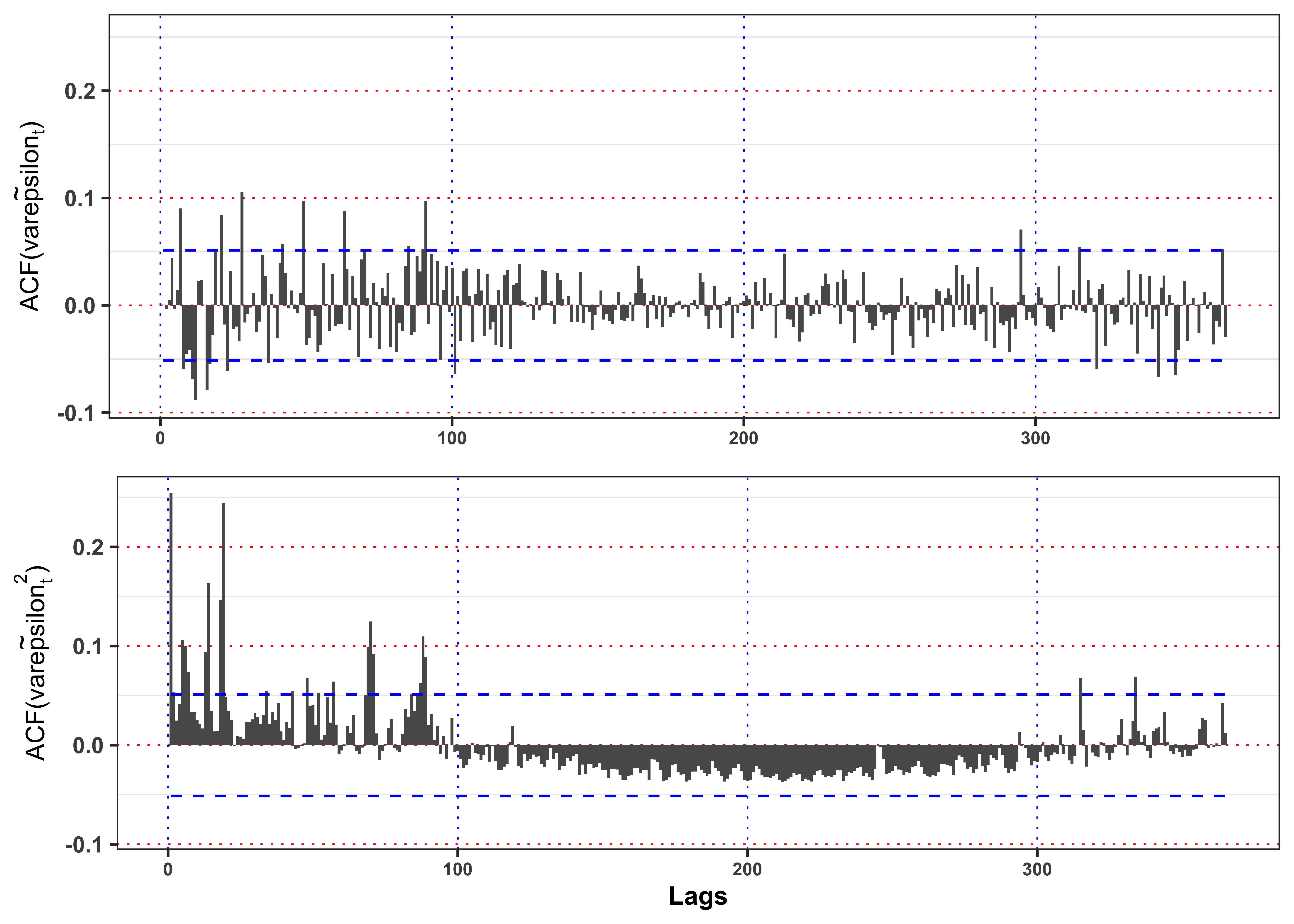
As shown in Figure 14 the squared residuals still present a significant autocorrelation in variance that will make them not identically distributed.
Code
library(latex2exp)
plot_eps <- ggplot(data_prices)+
  geom_point(aes(date, eps), color = "black", size = 0.1, alpha = 0.4)+
  geom_line(aes(date, 3*sigma_bar, color = "sigma3"), size = 0.4)+
  geom_line(aes(date, 2*sigma_bar, color = "sigma2"), size = 0.4)+
  geom_line(aes(date, 1*sigma_bar, color = "sigma1"), size = 0.4)+
  geom_line(aes(date, -1*sigma_bar, color = "sigma1"), size = 0.4)+
  geom_line(aes(date, -2*sigma_bar, color = "sigma2"), size = 0.4)+
  geom_line(aes(date, -3*sigma_bar, color = "sigma3"), size = 0.4)+
  labs(x = NULL, y = TeX("$\\epsilon_t$"), color = NULL)+
  theme_bw()+
  custom_theme+
  theme(legend.position = "top")+
  scale_color_manual(values = c(sigma1 = "green", sigma2 = "orange", sigma3 = "red", std_eps = "darkorange"),
                     labels = c(sigma1 = TeX("$\\pm \\bar{\\sigma}$"),
                                sigma2 = TeX("$\\pm 2\\bar{\\sigma}$"),
                                sigma3 = TeX("$\\pm 3\\bar{\\sigma}$"),
                                std_eps = TeX("$\\bar{\\epsilon}_t = \\frac{\\epsilon_t}{\\bar{\\sigma}}$")))
plot_std_eps <- ggplot(data_prices)+
  geom_point(aes(date, std_eps), color = "black", size = 0.1, alpha = 0.4)+
  geom_line(aes(date, 3, color = "sigma3"), size = 0.4)+
  geom_line(aes(date, 2, color = "sigma2"), size = 0.4)+
  geom_line(aes(date, 1, color = "sigma1"), size = 0.4)+
  geom_line(aes(date, -1, color = "sigma1"), size = 0.4)+
  geom_line(aes(date, -2, color = "sigma2"), size = 0.4)+
  geom_line(aes(date, -3, color = "sigma3"), size = 0.4)+
  labs(x = NULL, y = TeX("$\\bar{\\epsilon}_t$"), color = NULL)+
  scale_color_manual(values = c(sigma1 = "green", sigma2 = "orange", sigma3 = "red"))+
  theme_bw()+
  custom_theme+
  theme(legend.position = "none")

gridExtra::grid.arrange(plot_eps, plot_std_eps, ncol = 1, heights = c(0.6, 0.4))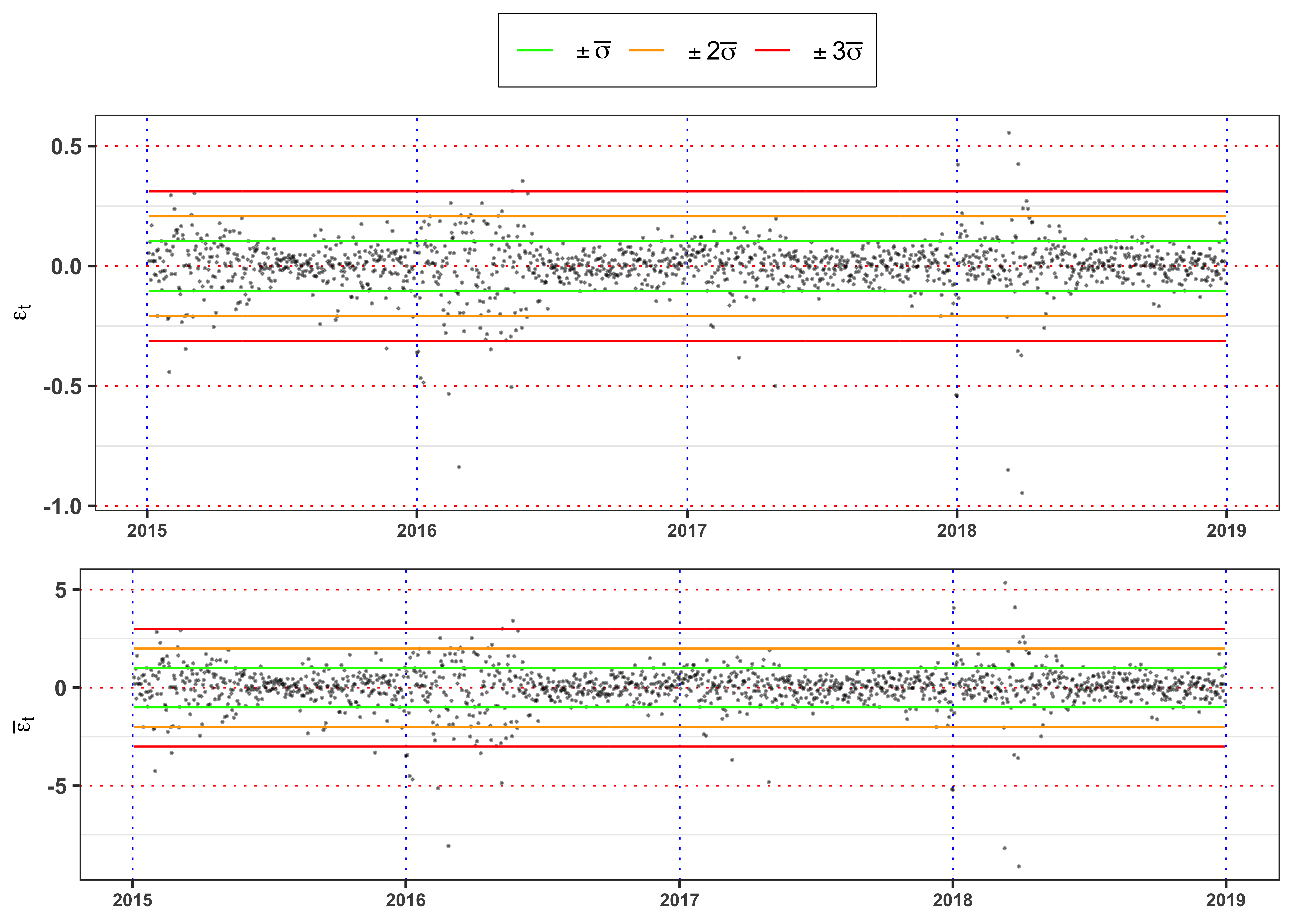
The graph above shows clearly that the standardized residuals presents volatility clusters, hence the time series of \(\bar{\epsilon}_t\) will be not identically distributed. A formal way to test it, is a two sample Kolmogorov-Smirnov.
KS-test on \(\tilde{\varepsilon}_t\)
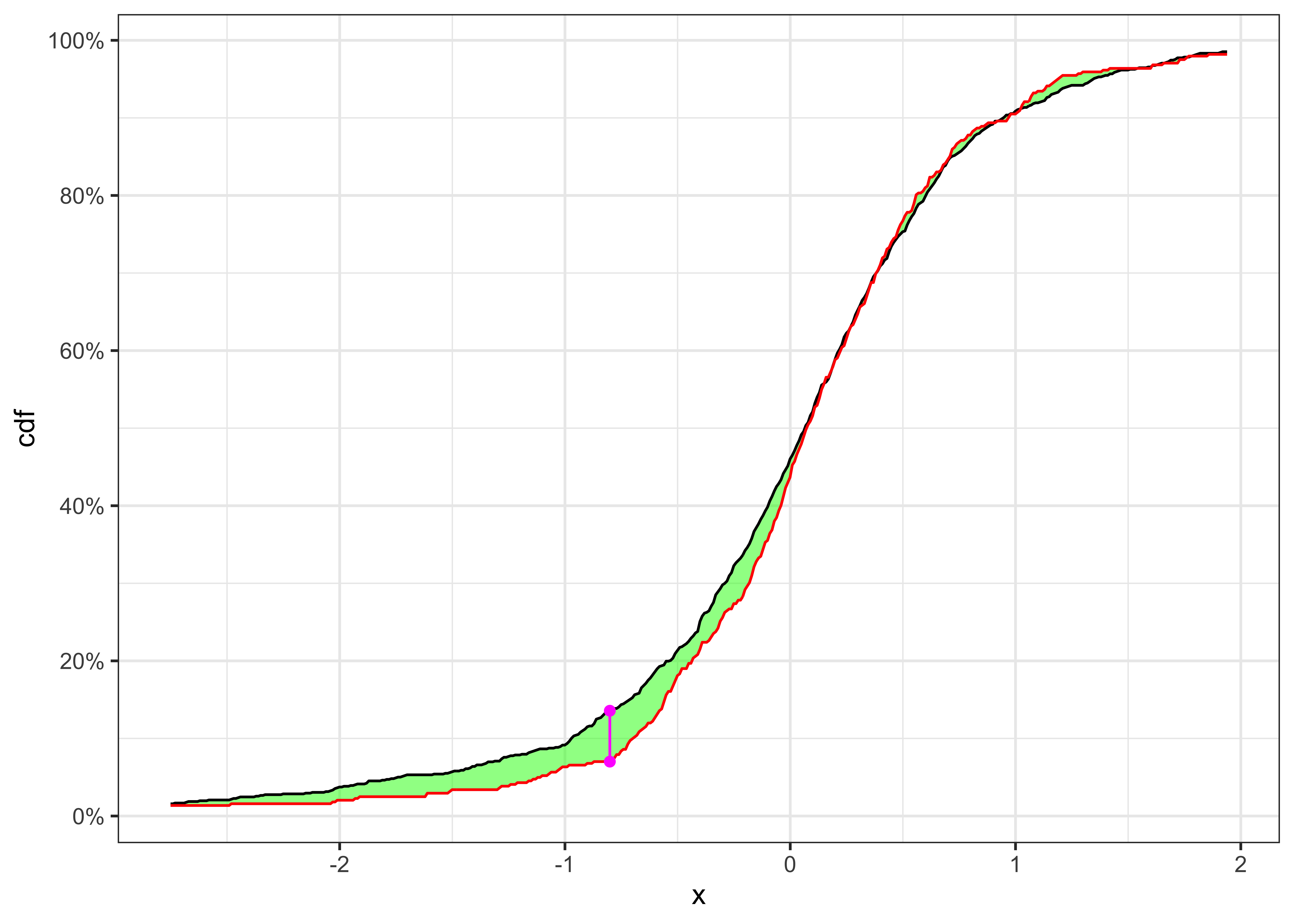
KS-test \(\tilde{\varepsilon}_t\)
kab <- ks_test_ts(na.omit(data_prices$std_eps), ci = 0.01, seed = 2) %>%
  dplyr::mutate_if(is.numeric, format, digits = 4, scientific = FALSE)
colnames(kab) <- c("Index split", "$$\\alpha$$", "$$n_1$$", "$$n_2$$",
                   "$$KS_{n_1, n_2}$$", "p.value", "Critical Level", "$$H_0$$")
knitr::kable(kab, booktabs = TRUE, escape = FALSE, align = 'c')%>%
kableExtra::row_spec(0, color = "white", background = "green") | Index split | $$\alpha$$ | $$n_1$$ | $$n_2$$ | $$KS_{n_1, n_2}$$ | p.value | Critical Level | $$H_0$$ |
|---|---|---|---|---|---|---|---|
| 975 | 1% | 975 | 484 | 0.06512 | 0.5124 | 0.0905 | Non-Rejected |
The null hypothesis of independence and identically distribution is rejected, hence we have to define a model for the conditional variance of the process.
Test Autocorrelation on the ARMA standardized residuals.
data_test <- data_prices
# Number of lags to test
lag.max <- 7
# Add lagged variables
for(i in 1:lag.max){
  data_test[[paste0("L", i, "_std_eps")]] <- dplyr::lag(data_test$std_eps, i)
}
# Select only relevant variables
data_test <- na.omit(dplyr::select(data_test, contains("std_eps")))
# Fit an AR(p) model
ARMA_model_test <- lm(std_eps ~ ., data = data_test)
Table statistics.
glance_ARMA_model_test <-   broom::glance(ARMA_model_test)
glance_ARMA_model_test %>%
  select(-AIC, -BIC, -logLik) %>%
  dplyr::mutate_if(is.numeric, format, digits = 4, scientific = FALSE) %>%
  knitr::kable(booktabs = TRUE, escape = FALSE, align = 'c') %>%
kableExtra::row_spec(0, color = "white", background = "green") | r.squared | adj.r.squared | sigma | statistic | p.value | df | deviance | df.residual | nobs |
|---|---|---|---|---|---|---|---|---|
| 0.01026 | 0.005463 | 0.998 | 2.139 | 0.03705 | 7 | 1438 | 1444 | 1452 |
Table estimates.
tidy_ARMA_model_test <- broom::tidy(ARMA_model_test)
tidy_ARMA_model_test %>%
  dplyr::mutate(term = paste0("$$a_", 0:lag.max, "$$")) %>%
  dplyr::mutate_if(is.numeric, format, digits = 4, scientific = FALSE)  %>%
  knitr::kable(booktabs = TRUE, escape = FALSE, align = 'c') %>%
kableExtra::row_spec(0, color = "white", background = "green") | term | estimate | std.error | statistic | p.value |
|---|---|---|---|---|
| $$a_0$$ | -0.0021308 | 0.02619 | -0.081354 | 0.9351715 |
| $$a_1$$ | -0.0001462 | 0.02621 | -0.005578 | 0.9955504 |
| $$a_2$$ | -0.0053908 | 0.02622 | -0.205615 | 0.8371207 |
| $$a_3$$ | 0.0007113 | 0.02619 | 0.027153 | 0.9783418 |
| $$a_4$$ | 0.0429757 | 0.02617 | 1.642383 | 0.1007284 |
| $$a_5$$ | -0.0028748 | 0.02619 | -0.109781 | 0.9125983 |
| $$a_6$$ | 0.0142256 | 0.02619 | 0.543246 | 0.5870442 |
| $$a_7$$ | 0.0901152 | 0.02619 | 3.441149 | 0.0005958 |
As we can see the coefficients -0.00213 has a p-value of 0.935 and so it is not statistically different from zero. However, the F-test equal to 2.139 has a p-value equal to 0.037 so we do not reject the null hypothesis that all the AR coefficients are jointly equal to zero with 3.7 % confidence level. Therefore, with the ARMA model we do not have anymore autocorrelation in mean that the AR(1) was not able to completely remove.
4.3 Task B.3
4.3.1 Task B.3 (a)
A popular approach to model the conditional variance of a time series is a GARCH(p,q) model. For simplicity, let’s consider a GARCH(1,1) model, i.e. \[ \begin{aligned} & {}\varepsilon_t = \sigma_{t} u_t \\ & \sigma_{t}^2 = \omega + \alpha \varepsilon_{t-1}^2 + \beta \sigma_{t-1}^2 \\ & u_{t} \sim \; \text{IID}(0, 1) \end{aligned} \] In general, the parameters of such models are estimated with a Quasi-Maximum Likelihood approach where, as long as the residuals are identically distributed, independent and with mean zero and unitary variance, one can estimate the parameters by assuming a normal distribution for \(u_t\). Moreover, to ensure that the long-term GARCH variance is coherent with the variance estimated on the residuals \(\varepsilon_t\), is it possible to constraint \(\omega\) as follows, i.e. \[ \sigma_{t}^2 = \sigma_{\varepsilon}^2 + \alpha (1 - \sigma_{\varepsilon}^2) \varepsilon_{t-1}^2 + \beta (1 - \sigma_{\varepsilon}^2) \sigma_{t-1}^2 \text{.} \] Compute the long-term GARCH(1,1) variance, i.e. \(\mathbb{E}\{\sigma_t^2\}\) \[ \sigma_{\infty}^2 = \mathbb{E}\{\sigma_t^2\} = \frac{\omega}{1-\alpha-\beta} \text{,} \] and compare it with the variance estimated \(\sigma_{\varepsilon}^2\) estimated in Section 4.2.2. Are the two variances equal? Is the estimated model stationary?
Hint: For the parameter estimation you can consider the R package rugarch in which is implemented the QMLE estimator, the possibility to automatically contraint the variance and many others different GARCH models. For the stationarity condition check the estimated parameters \(\alpha\) and \(\beta\).
Fit the GARCH model.
# Variance specification
GARCH_spec <- rugarch::ugarchspec(
  variance.model = list(model = "sGARCH", garchOrder = c(1,1), variance.targeting = data_prices$sigma_bar[1]^2),
  mean.model = list(armaOrder = c(0,0), include.mean = FALSE), distribution.model = "norm")
# GARCH fitted model
GARCH_model <- rugarch::ugarchfit(data = data_prices$eps, spec = GARCH_spec, out.sample = 0)
# Fitted GARCH standard deviation
data_prices$sigma <- GARCH_model@fit$sigma
# Fitted standardized residuals
data_prices$ut <- data_prices$eps / data_prices$sigma
Table GARCH estimates.
# GARCH parameters
GARCH_params <- GARCH_model@fit$coef
# Std. deviation of the parameters
GARCH_errors <- GARCH_model@fit$se.coef
names(GARCH_errors) <- names(GARCH_params)
# Long-term GARCH standard deviation
sigma2_inf <- GARCH_params["omega"] / (1-GARCH_params["alpha1"]-GARCH_params["beta1"])

kab <- dplyr::tibble(
  params = c("$$\\omega$$", "$$\\alpha$$", "$$\\beta$$", "$$\\sigma^2_{\\infty}$$"),
  estimates = c(GARCH_params["omega"], GARCH_params["alpha1"], GARCH_params["beta1"],  sigma2_inf),
  se.coef = c(GARCH_errors["omega"], GARCH_errors["alpha1"], GARCH_errors["beta1"],  NA_integer_)) %>%
  dplyr::mutate_if(is.numeric, format, digits = 4, scientific = FALSE)
knitr::kable(kab, booktabs = TRUE, escape = FALSE, align = 'c')%>%
kableExtra::row_spec(0, color = "white", background = "green") | params | estimates | se.coef |
|---|---|---|
| $$\omega$$ | 0.0003374 | NA |
| $$\alpha$$ | 0.1793855 | 0.01242 |
| $$\beta$$ | 0.7892810 | 0.01486 |
| $$\sigma^2_{\infty}$$ | 0.0107691 | NA |
Since the sum \(\alpha + \beta =\) 0.79 is less than 1 in absolute value the model is stationary.
Figure GARCH residuals.
plot_eps <- ggplot(data_prices)+
  geom_point(aes(date, eps), color = "black", size = 0.1, alpha = 0.4)+
  geom_line(aes(date, 3*sigma, color = "sigma3"), size = 0.4)+
  geom_line(aes(date, 2*sigma, color = "sigma2"), size = 0.4)+
  geom_line(aes(date, 1*sigma, color = "sigma1"), size = 0.4)+
  geom_line(aes(date, -1*sigma, color = "sigma1"), size = 0.4)+
  geom_line(aes(date, -2*sigma, color = "sigma2"), size = 0.4)+
  geom_line(aes(date, -3*sigma, color = "sigma3"), size = 0.4)+
  labs(x = NULL, y = TeX("$\\epsilon_t$"), color = NULL)+
  theme_bw()+
  custom_theme+
  theme(legend.position = "top")+
  scale_color_manual(values = c(sigma1 = "green", sigma2 = "orange", sigma3 = "red", std_eps = "darkorange"),
                     labels = c(sigma1 = TeX("$\\pm \\bar{\\sigma}$"),
                                sigma2 = TeX("$\\pm 2\\bar{\\sigma}$"),
                                sigma3 = TeX("$\\pm 3\\bar{\\sigma}$"),
                                std_eps = TeX("$\\bar{\\epsilon}_t = \\frac{\\epsilon_t}{\\bar{\\sigma}}$")))
plot_std_eps <- ggplot(data_prices)+
  geom_point(aes(date, ut), color = "black", size = 0.1, alpha = 0.4)+
  geom_line(aes(date, 3, color = "sigma3"), size = 0.4)+
  geom_line(aes(date, 2, color = "sigma2"), size = 0.4)+
  geom_line(aes(date, 1, color = "sigma1"), size = 0.4)+
  geom_line(aes(date, -1, color = "sigma1"), size = 0.4)+
  geom_line(aes(date, -2, color = "sigma2"), size = 0.4)+
  geom_line(aes(date, -3, color = "sigma3"), size = 0.4)+
  labs(x = NULL, y = TeX("$u_t$"), color = NULL)+
  scale_color_manual(values = c(sigma1 = "green", sigma2 = "orange", sigma3 = "red"))+
  theme_bw()+
  custom_theme+
  theme(legend.position = "none")

gridExtra::grid.arrange(plot_eps, plot_std_eps, ncol = 1, heights = c(0.6, 0.4))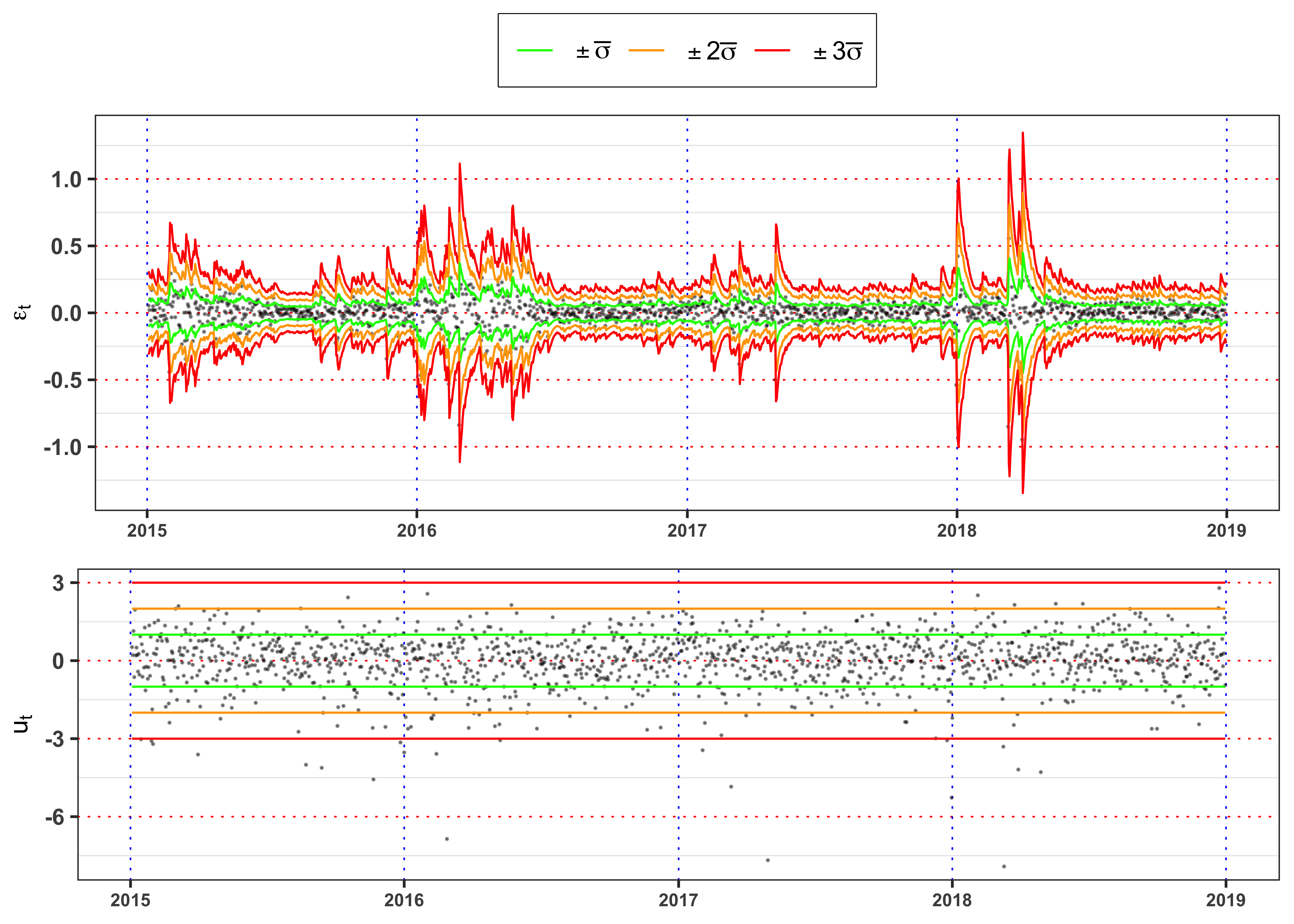
Figure GARCH standard deviation.
ggplot(data_prices)+
  geom_line(aes(date, sigma, color = "sigma"), size = 0.3)+
  geom_line(aes(date, sigma_bar, color = "sigma_bar"))+
  geom_line(aes(date, sqrt(sigma2_inf), color = "sigma0"), linetype = "dashed")+
  geom_line(aes(date, 0, color = "std_eps"), alpha = 0)+
  labs(x = NULL, y = TeX("$\\sigma_t$"), color = NULL)+
  #scale_y_continuous(limits = c(min(data_prices$sigma), max(data_prices$sigma)))+
  scale_color_manual(values = c(sigma = "black", sigma0 = "red", sigma_bar = "blue"),
                     labels = c(sigma = TeX("$\\sigma_t$"),
                                sigma0 = TeX("$\\sigma_0$"),
                                sigma_bar = TeX("$\\bar{\\sigma}$")))+
  theme_bw()+
  custom_theme+
  theme(legend.position = "top")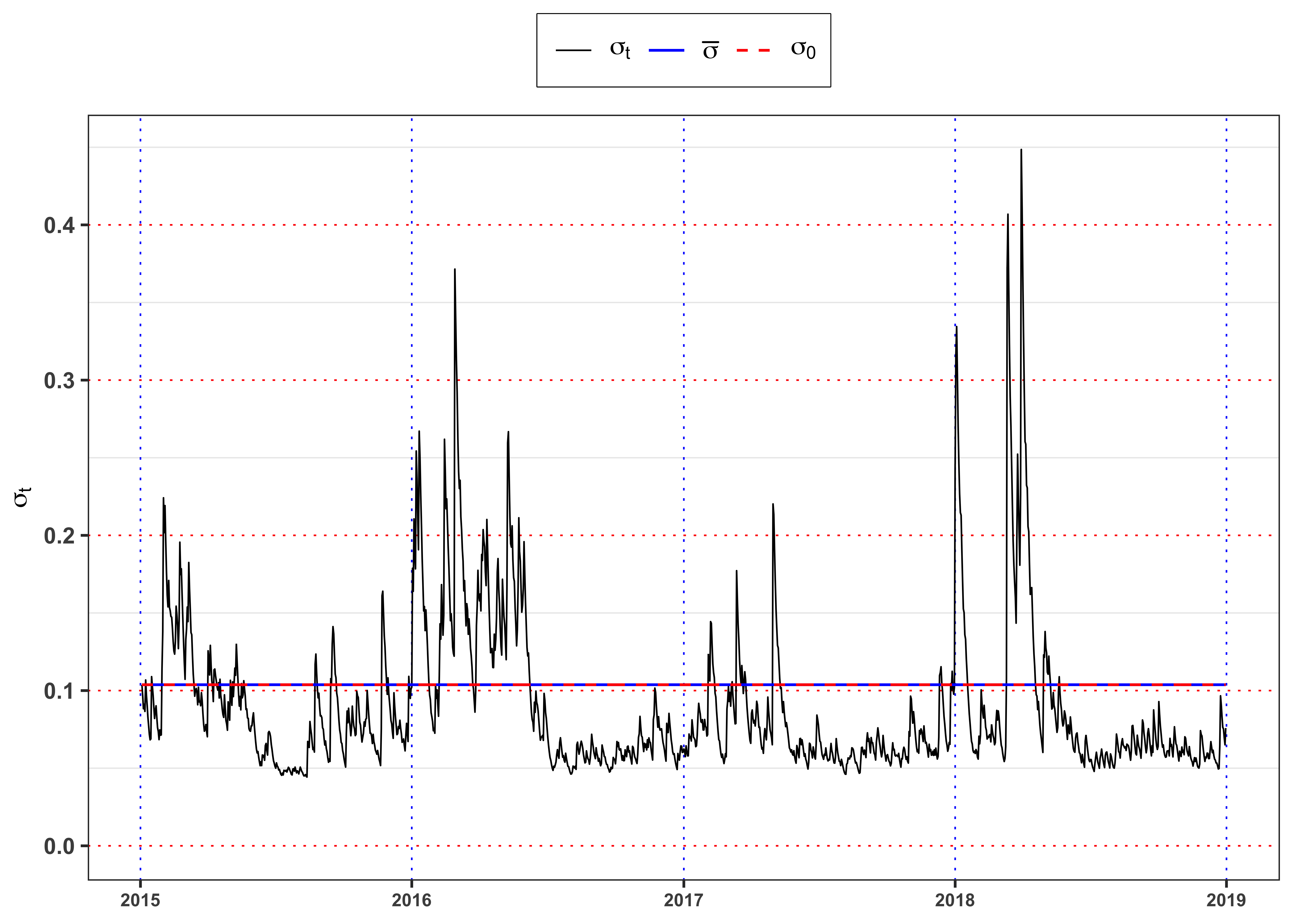
4.3.2 Task B.3 (b)
Once the parameters \(\omega\), \(\alpha\) and \(\beta\) are estimated, the series of GARCH variance \(\sigma_t^2\) become available and one can compute the standardized GARCH residuals \[ u_t = \frac{\varepsilon_t}{\sigma_t} \text{.} \] Let’s verify if the assumption of the GARCH model holds. The assumption are three:
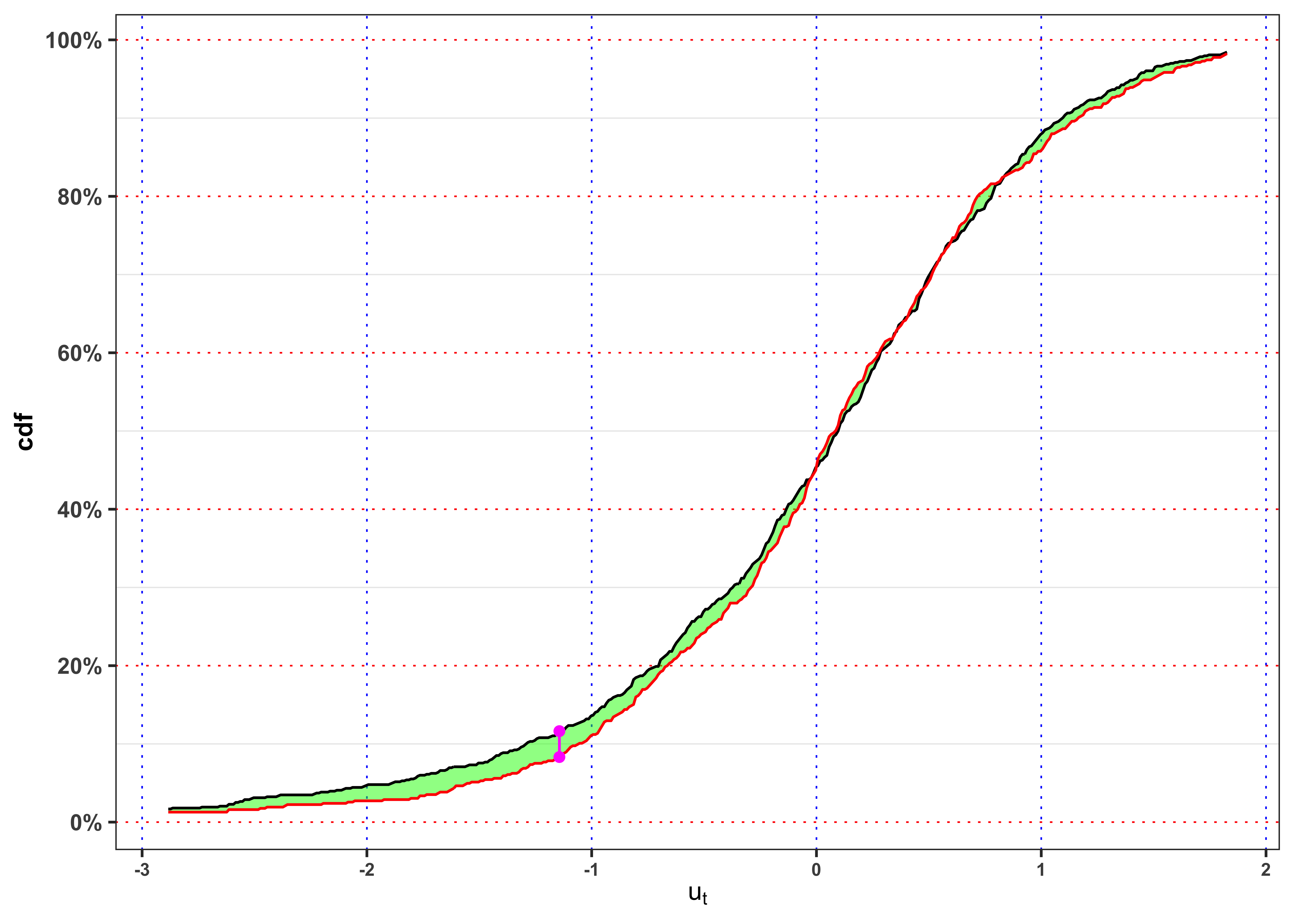
- Assumption 1.: Identically distributed residuals. We can verify this hypothesis with a two-sample Kolmogorov test.
Hint: You can consider the same implementation used in Section 4.2.2.
Assumption 2.: Uncorrelated residuals. If we do not reject 1. we can use Box-cox test.
Assumption 3.: The assumption of the QMLE estimatior is that the residuals are normally distributed, i.e. \(u_t \sim \mathcal{N}(0,1)\). We can verify this hypothesis with a Kolmogorov test by comparing the empirical distribution of \(u_t\) with the theoric distribution of a standard normal.
Hint: You can consider the following implementation for the Kolmogorov Smirnov Test for a distribution. (See here) for more details)
Kolmogorov Smirnov Test for a Distribution
#' Kolmogorov distribution functions
#'
#' @param x vector of quantiles.
#' @param p vector of probabilities.
#' @param k finite value for approximation of infinite sum.
#' @return A probability, a numeric vector in 0, 1.
#' @examples
#' pks(2, 1000)
#' pks(10, 1000)
pks <- function(x, k = 1000){
  # Infinite sum function
  # k: approximation for infinity
  inf_sum <- function(x, k = 100){
    isum <- 0
    for(i in 1:k){
      isum <- isum + (-1)^(i-1)*exp(-2*(x^2)*(i^2))
    }
    isum <- 2 * isum
    isum
  }
  # Compute probability
  p <- c()
  for(i in 1:length(x)){
    p[i] <- 1 - ifelse(x[i] <= 0, 1, inf_sum(x[i], k = k))
  }
  p[p<0] <- 0
  return(p)
}

#' Kolmogorov quantile functions
#' @param p vector of probabilities.
qks <- function(p, k = 100, upper = 10){
  loss <- function(x, p){
    (pks(x, k = k) - p)^2
  }
  x <- c()
  for(i in 1:length(p)){
    x[i] <- optim(par = 2, method = "Brent", lower = 0, upper = upper, fn = loss, p = p[i])$par
  }
  return(x)
}

#' Kolmogorov Smirnov test for a distribution
#'
#' Test against a specific distribution
#'
#' @param x a vector.
#' @param cdf a function. The theoric distribution to use for comparison.
#' @param ci p.value for rejection.
#' @param min_quantile minimum quantile for the grid of values.
#' @param max_quantile maximum quantile for the grid of values.
#' @param k finite value for approximation of infinite sum.
#' @param plot when `TRUE` a plot is returned, otherwise a `tibble`.
#' @return when `plot = TRUE` a plot is returned, otherwise a `tibble`.
ks_test <- function(x, cdf, ci = 0.05, min_quantile = 0.015, max_quantile = 0.985, k = 1000, plot = FALSE){
  # number of observations
  n <- length(x)
  # Set the interval values for upper and lower band
  grid <- seq(quantile(x, min_quantile), quantile(x, max_quantile), 0.01)
  # Empirical cdf
  cdf_x <- ecdf(x)
  # Compute the KS-statistic
  ks_stat <- sqrt(n)*max(abs(cdf_x(grid) - cdf(grid)))
  # Compute the rejection level
  rejection_lev <- qks(1-ci, k = k)
  # Compute the p-value
  p.value <- 1-pks(ks_stat, k = k)

  # ========================== Plot ==========================
  if (plot) {
    y_breaks <- seq(0, 1, 0.2)
    y_labels <- paste0(format(y_breaks*100, digits = 2), "%")
    grid_max <- grid[which.max(abs(cdf_x(grid) - cdf(grid)))]
    plt <- ggplot()+
      geom_ribbon(aes(grid, ymax = cdf_x(grid), ymin = cdf(grid)),
                  alpha = 0.5, fill = "green") +
      geom_line(aes(grid, cdf_x(grid)))+
      geom_line(aes(grid, cdf(grid)), color = "red")+
      geom_segment(aes(x = grid_max, xend = grid_max,
                       y = cdf_x(grid_max), yend = cdf(grid_max)),
                   linetype = "solid", color = "magenta")+
      geom_point(aes(grid_max, cdf_x(grid_max)), color = "magenta")+
      geom_point(aes(grid_max, cdf(grid_max)), color = "magenta")+
      scale_y_continuous(breaks = y_breaks, labels = y_labels)+
      labs(x = "x", y = "cdf")+
      theme_bw()
    return(plt)
  } else {
    kab <- dplyr::tibble(
      n = n,
      alpha = paste0(format(ci*100, digits = 3), "%"),
      KS = ks_stat,
      rejection_lev = rejection_lev,
      p.value = p.value,
      H0 = ifelse(KS > rejection_lev, "Rejected", "Non-Rejected"))
    class(kab) <- c("ks_test", class(kab))
    return(kab)
  }
}KS-test on \(u_t\)
KS-test \(u_t\).
kab <- ks_test_ts(na.omit(data_prices$ut), ci = 0.01, seed = 2) %>%
  mutate_if(is.numeric, format, digits = 4, scientific = FALSE)
colnames(kab) <- c("Index split", "$$\\alpha$$", "$$n_1$$", "$$n_2$$",
                   "$$KS_{n_1, n_2}$$", "p.value", "Critical Level", "$$H_0$$")
knitr::kable(kab, booktabs = TRUE, escape = FALSE, align = 'c') %>%
kableExtra::row_spec(0, color = "white", background = "green") | Index split | $$\alpha$$ | $$n_1$$ | $$n_2$$ | $$KS_{n_1, n_2}$$ | p.value | Critical Level | $$H_0$$ |
|---|---|---|---|---|---|---|---|
| 975 | 1% | 975 | 484 | 0.05389 | 0.7872 | 0.0905 | Non-Rejected |
Since we do not reject the hypothesis of identical distribution we can apply a Box.cox test for autocorrelation
Box-Cox test \(u_t\) and u_t^2$.
| Term | statistic | p.value | parameter | method |
|---|---|---|---|---|
| $u_t$ | 5.603438 | 0.3467367 | 5 | Box-Pierce test |
| $u_t^2$ | 10.382843 | 0.0650865 | 5 | Box-Pierce test |
KS-test on \(u_t\)
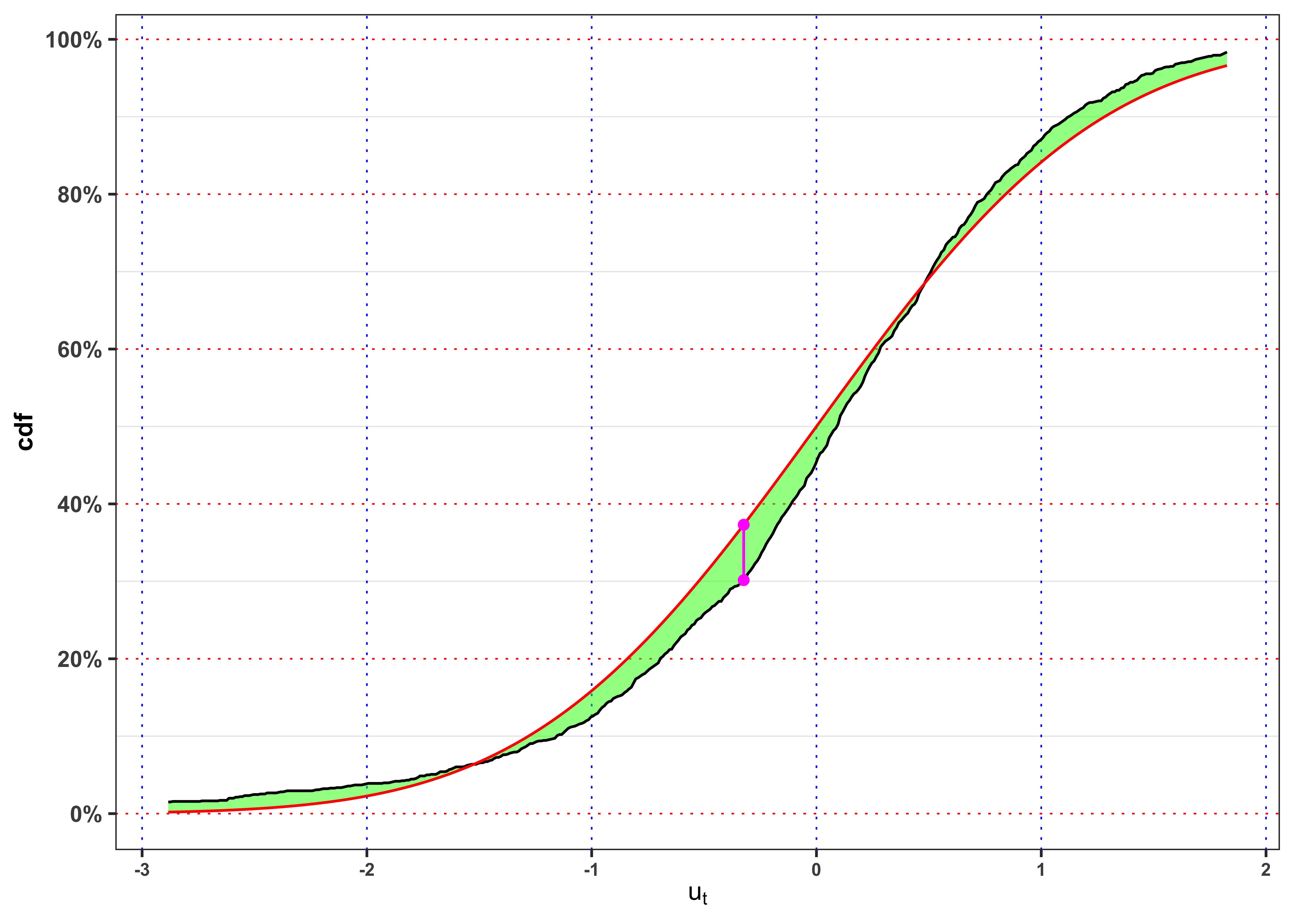
Normality KS-test \(u_t\).
kab <- ks_test(na.omit(data_prices$ut), cdf = function(x) pnorm(x), ci = 0.01, plot = FALSE) %>%
  mutate_if(is.numeric, round, digits = 4)
colnames(kab) <- c("$n$", "$$\\alpha$$", "$$KS_{n}$$", "Critical Level", "p.value", "$$H_0$$")
knitr::kable(kab, booktabs = TRUE, escape = FALSE, align = 'c') %>%
kableExtra::row_spec(0, color = "white", background = "green") | $n$ | $$\alpha$$ | $$KS_{n}$$ | Critical Level | p.value | $$H_0$$ |
|---|---|---|---|---|---|
| 1459 | 1% | 2.732 | 1.6276 | 0 | Rejected |
4.4 Task B.4
Let’s consider a Gaussian mixture distribution for the GARCH residuals, i.e. \[ u_t \sim B \cdot (\mu_{1} + \sigma_{1} Z_1) + (1-B) \cdot (\mu_{2} + \sigma_{2} Z_2) \]
where \(B \sim \text{Bernoulli}(p)\), while \(Z_1\) and \(Z_2\) are standard normal. All are assumed to be independent. Estimate the parameters \(\mu_{1}\), \(\mu_{2}\), \(\sigma_{1}\), \(\sigma_{2}\) and \(p\) with maximum likelihood (see here for an example). Consider the estimated parameters and give a possible interpretation of the two states, i.e. B = 1, B = 0.
Yearly Gaussian Mixture parameters.
# Fit a mixture model for all the year
sm <- mclust::Mclust(data_prices$ut, G = 2)
# Means
mu <- sm$parameters$mean
sigma <- sqrt(sm$parameters$variance$scale)
probs <- sm$parameters$pro
# Mixture density
dnorm_mix <- function(x, mu, sigma, probs){
  dnorm(x, mu[1], sigma[1])*probs[1] + dnorm(x, mu[2], sigma[2])*probs[2]
}
# Mixture distribution
pnorm_mix <- function(x, mu, sigma, probs){
  pnorm(x, mu[1], sigma[1])*probs[1] + pnorm(x, mu[2], sigma[2])*probs[2]
}

# Log-likelihood
loglik <- sum(log(dnorm_mix(data_prices$ut, mu, sigma, probs)))
kab <- dplyr::tibble(mu1 = mu[1], mu2 = mu[2], sd1 = sigma[1], sd2 = sigma[2], p1 = probs[1], p2 = probs[2]) %>%
  bind_cols(log_lik = loglik, mu_u = mean(data_prices$ut), sd_u = sd(data_prices$ut)) %>%
  mutate_if(is.numeric, format, digits = 4, scientific = FALSE)


sum(mu*probs)
## [1] -0.009603254
sqrt(sum((mu^2 + sigma^2)*probs) - sum(mu*probs)^2)
## [1] 1.038544

knitr::kable(kab,
    escape = FALSE,
    col.names = c("$$\\mu_1$$", "$$\\mu_2$$",
                  "$$\\sigma_1$$", "$$\\sigma_2$$", "$$p_1$$", "$$1-p_1$$",
"log-lik", "$$\\mathbb{E}\\{u_t\\}$$", "$$\\mathbb{S}d\\{u_t\\}$$"))| \[\mu_1\] | \[\mu_2\] | \[\sigma_1\] | \[\sigma_2\] | \[p_1\] | \[1-p_1\] | log-lik | \[\mathbb{E}\{u_t\}\] | \[\mathbb{S}d\{u_t\}\] |
|---|---|---|---|---|---|---|---|---|
| -1.475 | 0.1389 | 1.79 | 0.7897 | 0.09202 | 0.908 | -1992 | -0.009603 | 1.039 |
Yearly Gaussian Mixture vs Empirical densities
grid <- seq(min(data_prices$ut), max(data_prices$ut), 0.01)
ggplot()+
  geom_density(data = data_prices, aes(ut, ..density..), color = "black")+
  geom_line(aes(grid, 0, color = "ut"), alpha = 0)+
  geom_line(aes(grid, dnorm_mix(grid, mu, sigma, probs), color = "nm"))+
  scale_color_manual(values = c(ut = "black", nm = "red"),
                     labels = c(ut = TeX("$u_t$"), nm = TeX("$GM(\\mu_1, \\mu_2, \\sigma_1, \\sigma_2, p)$")))+
  labs(x =  TeX("$u_t$"), y = "Density", color = NULL)+
  scale_x_continuous(limits = c(-5, 5))+
  theme_bw()+
  custom_theme+
  theme(legend.position = "top")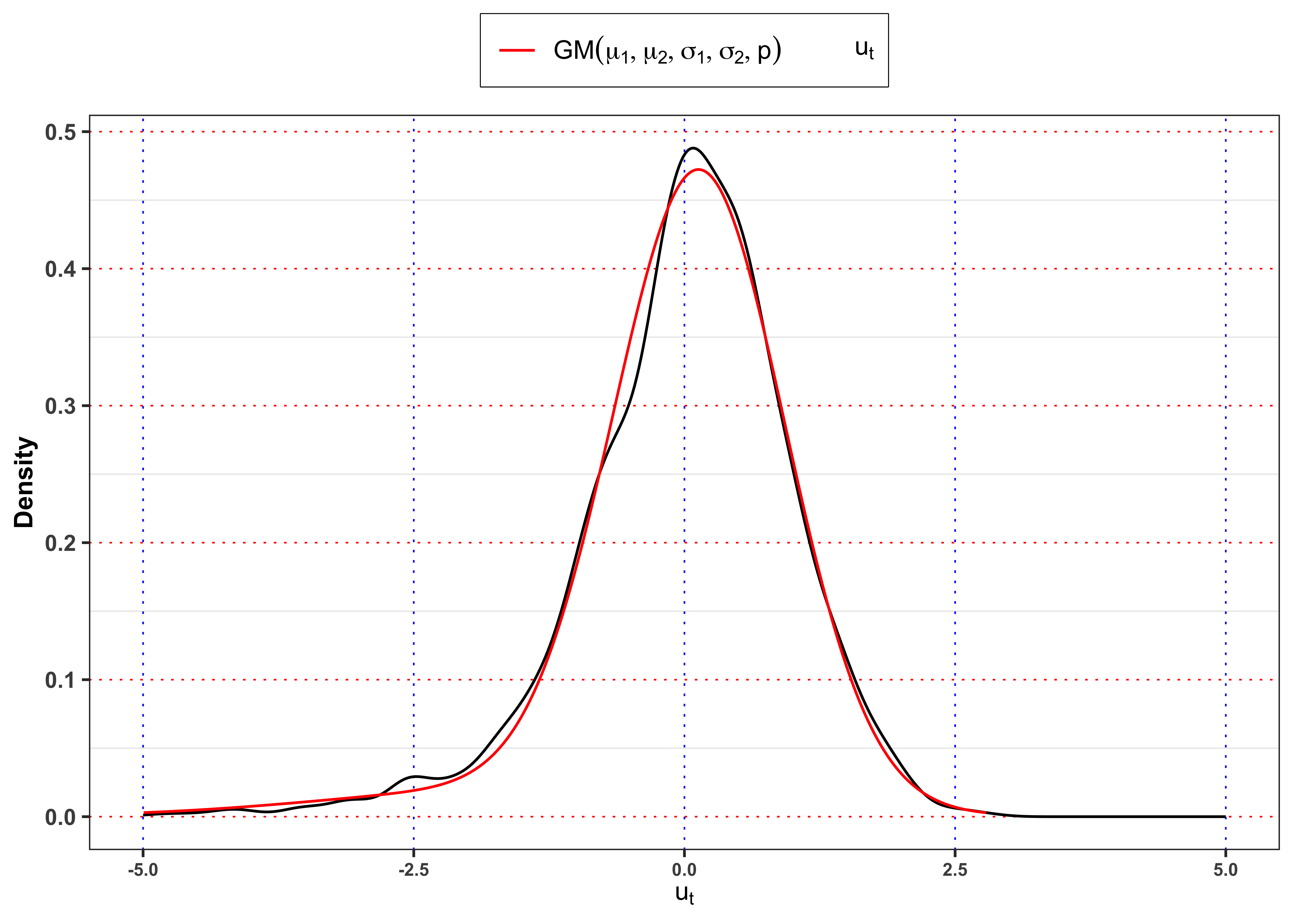
Gaussian Mixture vs monthly empirical densities.
pdf <- dnorm_mix(grid, mu, sigma, probs)
df_grid <- tibble(Month = lubridate::month(1, label = TRUE), grid = grid, pdf = pdf)
for(i in 2:12){
  df_grid <- bind_rows(df_grid, mutate(df_grid, Month = lubridate::month(i, label = TRUE)))
}
data_prices %>%
  mutate(Month = lubridate::month(date, label = TRUE)) %>%
  ggplot()+
  geom_density(aes(ut, ..density.., color = "ut"))+
  geom_line(data = df_grid, aes(grid, pdf, color = "nm"))+
    scale_color_manual(
      values = c(ut = "black", nm = "red"),
      labels = c(ut = TeX("$u_t$"), nm = TeX("$GM(\\mu_1, \\mu_2, \\sigma_1, \\sigma_2, p)$")))+
  facet_wrap(~Month)+
  labs(x =  TeX("$u_t$"), y = "Density", color = NULL)+
  scale_x_continuous(limits = c(-5, 5))+
  theme_bw()+
  custom_theme+
  theme(legend.position = "top")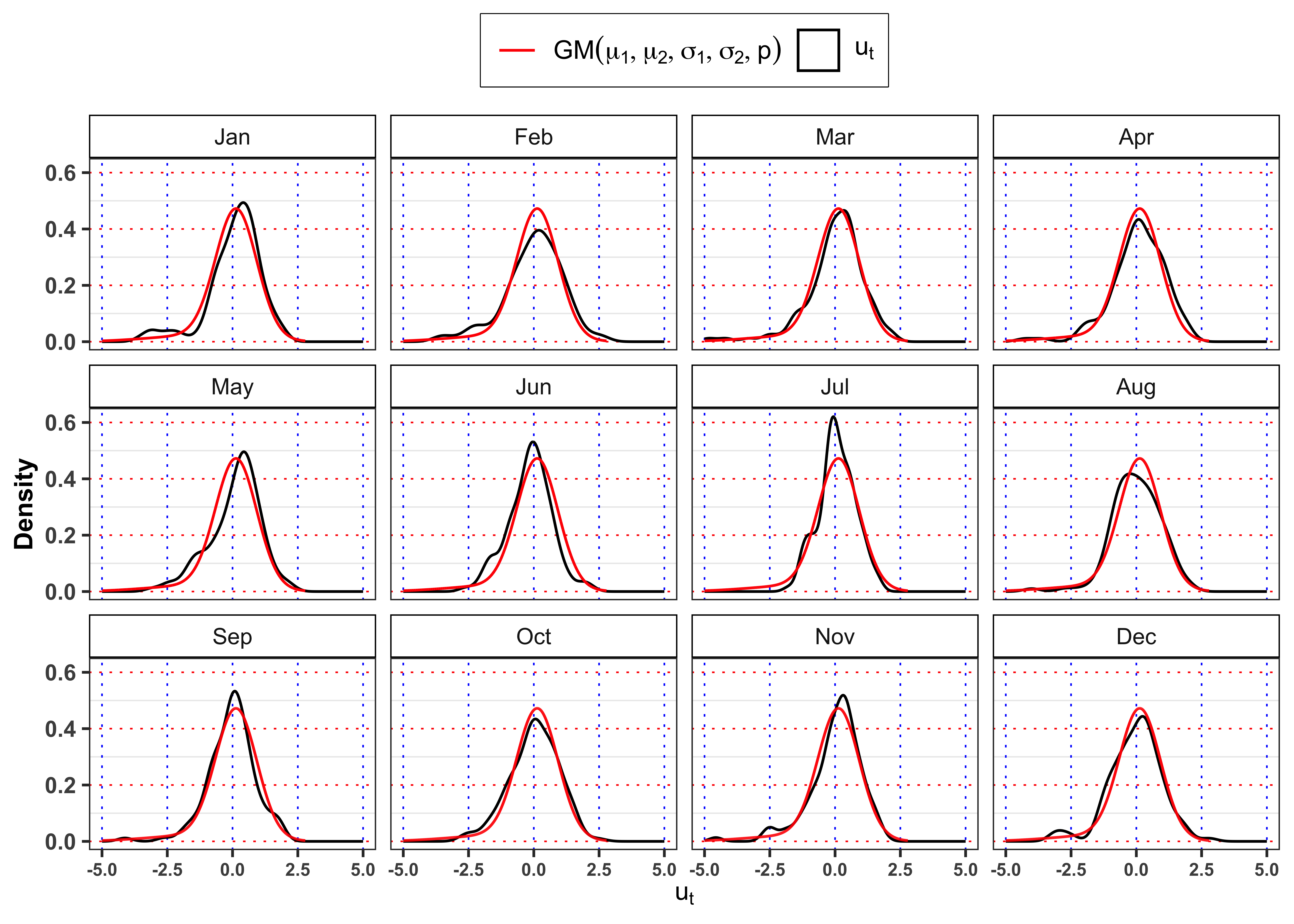
KS-test on \(u_t\)
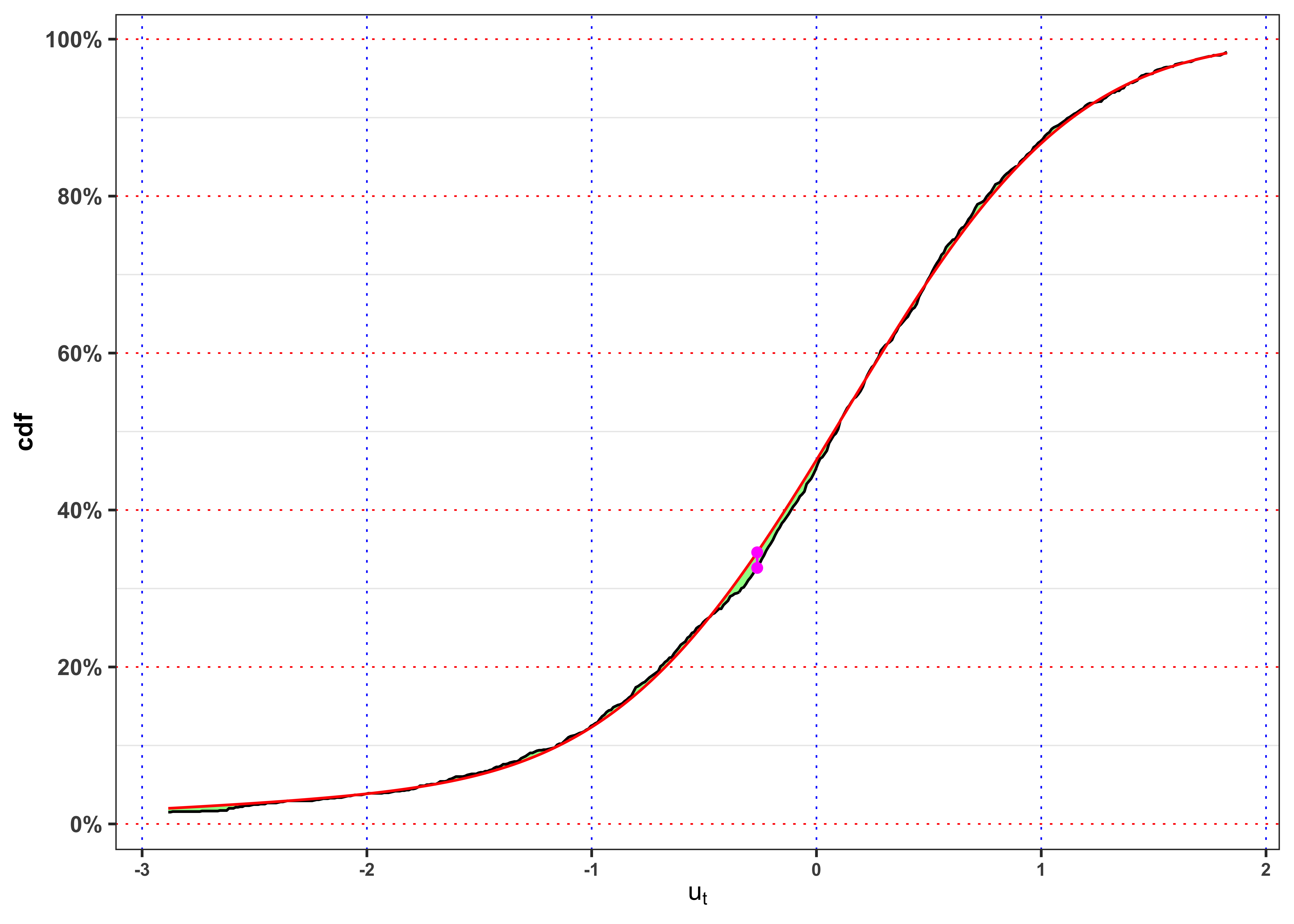
KS-test \(u_t\).
kab <- ks_test(na.omit(data_prices$ut), cdf = function(x) pnorm_mix(x,  mu, sigma, probs), ci = 0.01, plot = FALSE) %>%
  mutate_if(is.numeric, round, digits = 4)
colnames(kab) <- c("$n$", "$$\\alpha$$", "$$KS_{n}$$", "Critical Level", "p.value", "$$H_0$$")
knitr::kable(kab, booktabs = TRUE, escape = FALSE, align = 'c') %>%
kableExtra::row_spec(0, color = "white", background = "green") | $n$ | $$\alpha$$ | $$KS_{n}$$ | Critical Level | p.value | $$H_0$$ |
|---|---|---|---|---|---|
| 1459 | 1% | 0.7591 | 1.6276 | 0.6119 | Non-Rejected |
5 Task C
Let’s say that we want to understand the impact on price when demand increases and is satisfied by a specific energy source (e.g., fossil, hydro, wind, etc.). In practice we ask ourselves the following question:
“What happens to the price if demand increases by 1%, and that increase is matched by a 1% increase in, say, fossil output?”
This implies a price sensitivity to marginal supply source. Electricity prices are set by the marginal unit that supplies the last unit of demand. So:
- If the marginal increase in demand is met by cheap supply (e.g., wind), prices rise little.
- If it’s met by expensive generation (e.g., fossil), prices increase significantly.
To capture this in a model, we need a model that is able to distinguish which source is meeting the marginal demand.
5.1 Task C.1
Let’s decompose the demand across sources by defining a model of the form \[ S_t = \beta_0 + \beta_1 d_t + \gamma_1 d_t T_t + \sum_{\ast} \gamma_{\ast} \cdot \left[d_t \cdot s_{\ast,t} \right] + \text{controls} + \varepsilon_t \text{,} \] where
- \(d_t = \log(D_t + 1)\): log electricity demand.
- \(\beta_1\): baseline elasticity of price to demand.
- \(T_t\): is the temperature.
- \(\gamma_{\ast}\): differential impact when demand is met by source \(\ast\).
- \(S_t = \log(P_t)\): log electricity price at time t from Equation 5.
- \(s_{\ast,t}\): share of demand met by source \(\ast\) from Equation 2.
- \(\text{controls}\) variables include the hour of day, weekday and month as in Equation 6.
Note that the use of \(\log(D_t + 1)\) instead of \(\log(D_t)\) is a practical solution when some values of demand might be zero or near-zero, preventing undefined or highly negative values. Adding 1 ensures the transformation is always valid. Taking the derivative of the price with respect to the demand one obtain a decomposition of the total price elasticity to demand at time t, depending on which source is satisfying this demand, i.e. \[ \partial_{d_t} S_t = \beta_1 + \gamma_1 T_t + \sum_{\ast} \gamma_{\ast} s_{\ast,t} \text{,} \tag{11}\] where each \(\gamma_{\ast}\) is interpreted as the sensitivity to electricity price is to a 1% change in demand on that source of energy.
Fit the sensitivity model.
# Create the dataset
data_fit <- data %>%
  dplyr::mutate(log_demand = log(demand + 1),
                other = energy_other+energy_other_renewable,
                s_other = (energy_other+energy_other_renewable)/demand*log_demand,
                s_biomass = biomass/demand*log_demand,
                s_solar = solar/demand*log_demand,
                hydroelettric = river,
                s_hydroelettric = hydroelettric/demand*log_demand,
                s_wind = wind/demand*log_demand,
                s_nuclear = nuclear/demand*log_demand,
                s_fossil = fossil/demand*log_demand,
                log_price = log(price),
                temp = temp*log_demand,
                Year_ = as.factor(Year),
                Weekday_ = as.factor(weekdays(date)),
                Month_ = as.factor(Month),
                Hour_ = as.factor(Hour)) %>%
  group_by(Year, Month, Day) %>%
  select(date, Year, Month, Day, Hour, Year_, Hour_, Weekday_, Month_,
         price, log_price, demand, log_demand,
         other, biomass, solar, hydroelettric, wind, nuclear, fossil,
         temp,
         s_other, s_biomass, s_solar, s_hydroelettric, s_wind, s_nuclear, s_fossil)
# Fit the impact model
impact_model <- lm(
  log_price ~ Hour_ + Weekday_ + Month_ + log_demand + temp  +
    s_other + s_biomass + s_solar + s_hydroelettric + s_wind + s_nuclear + s_fossil,
  data = data_fit
)
Table statistics.
| r.squared | adj.r.squared | sigma | statistic | p.value | deviance | df.residual | nobs |
|---|---|---|---|---|---|---|---|
| 0.4471 | 0.4463 | 0.2163 | 577.7977 | 0 | 1638.377 | 35014 | 35064 |
Table estimates.
| term | estimate | std.error | statistic | p.value |
|---|---|---|---|---|
| (Intercept) | 0.1494 | 0.1751 | 0.8534 | 0.3934 |
| Hour_1 | -0.0330 | 0.0080 | -4.1088 | 0.0000 |
| Hour_2 | -0.0550 | 0.0081 | -6.8345 | 0.0000 |
| Hour_3 | -0.0600 | 0.0081 | -7.4432 | 0.0000 |
| Hour_4 | -0.0229 | 0.0080 | -2.8512 | 0.0044 |
| Hour_5 | 0.0232 | 0.0081 | 2.8660 | 0.0042 |
| Hour_6 | 0.0860 | 0.0083 | 10.3798 | 0.0000 |
| Hour_7 | 0.1229 | 0.0086 | 14.2660 | 0.0000 |
| Hour_8 | 0.1431 | 0.0091 | 15.6580 | 0.0000 |
| Hour_9 | 0.1663 | 0.0097 | 17.1834 | 0.0000 |
| Hour_10 | 0.1707 | 0.0101 | 16.9787 | 0.0000 |
| Hour_11 | 0.1742 | 0.0103 | 16.9527 | 0.0000 |
| Hour_12 | 0.1631 | 0.0103 | 15.8048 | 0.0000 |
| Hour_13 | 0.1357 | 0.0102 | 13.2631 | 0.0000 |
| Hour_14 | 0.1208 | 0.0101 | 12.0104 | 0.0000 |
| Hour_15 | 0.1268 | 0.0098 | 12.9928 | 0.0000 |
| Hour_16 | 0.1581 | 0.0094 | 16.8235 | 0.0000 |
| Hour_17 | 0.2087 | 0.0091 | 22.8409 | 0.0000 |
| Hour_18 | 0.2437 | 0.0090 | 26.9597 | 0.0000 |
| Hour_19 | 0.2517 | 0.0090 | 27.9594 | 0.0000 |
| Hour_20 | 0.2100 | 0.0088 | 23.9533 | 0.0000 |
| Hour_21 | 0.1429 | 0.0084 | 16.9516 | 0.0000 |
| Hour_22 | 0.1007 | 0.0082 | 12.2896 | 0.0000 |
| Hour_23 | 0.0527 | 0.0080 | 6.5518 | 0.0000 |
| Weekday_Monday | 0.0045 | 0.0043 | 1.0428 | 0.2970 |
| Weekday_Saturday | -0.0629 | 0.0044 | -14.3093 | 0.0000 |
| Weekday_Sunday | -0.1194 | 0.0045 | -26.4603 | 0.0000 |
| Weekday_Thursday | 0.0064 | 0.0043 | 1.4919 | 0.1357 |
| Weekday_Tuesday | 0.0101 | 0.0043 | 2.3315 | 0.0197 |
| Weekday_Wednesday | 0.0024 | 0.0043 | 0.5591 | 0.5761 |
| Month_2 | -0.1304 | 0.0058 | -22.5472 | 0.0000 |
| Month_3 | -0.1705 | 0.0058 | -29.2185 | 0.0000 |
| Month_4 | -0.1098 | 0.0064 | -17.1061 | 0.0000 |
| Month_5 | -0.0547 | 0.0072 | -7.6049 | 0.0000 |
| Month_6 | 0.0894 | 0.0084 | 10.6677 | 0.0000 |
| Month_7 | 0.1439 | 0.0093 | 15.4391 | 0.0000 |
| Month_8 | 0.1258 | 0.0093 | 13.5458 | 0.0000 |
| Month_9 | 0.1115 | 0.0081 | 13.7816 | 0.0000 |
| Month_10 | 0.1213 | 0.0069 | 17.5233 | 0.0000 |
| Month_11 | 0.0594 | 0.0061 | 9.7015 | 0.0000 |
| Month_12 | 0.0971 | 0.0057 | 17.0270 | 0.0000 |
| log_demand | 0.3679 | 0.0162 | 22.7345 | 0.0000 |
| temp | -0.0009 | 0.0000 | -20.4696 | 0.0000 |
| s_other | 5.6336 | 0.1854 | 30.3879 | 0.0000 |
| s_biomass | 0.0512 | 0.0403 | 1.2709 | 0.2038 |
| s_solar | -0.0119 | 0.0042 | -2.8307 | 0.0046 |
| s_hydroelettric | -0.0370 | 0.0021 | -17.4828 | 0.0000 |
| s_wind | -0.0331 | 0.0015 | -22.1170 | 0.0000 |
| s_nuclear | -0.0546 | 0.0042 | -12.9825 | 0.0000 |
| s_fossil | 0.0215 | 0.0019 | 11.3573 | 0.0000 |
5.2 Task C.2
Let’s provide an interpretation of the main coefficients of the estimated model. Are the demands shocks equally expensive? Which is the source of energy that impact mostly on the price? Compute the impact of an increase in 1% in demand distinguished by the different sources. What are the policies that we can derive?
Function to predict \(\Delta S_t\)
predict_delta_St <- function(r = 0.05, temp = 25,
                             fossil = 0.2, nuclear = 0.2, wind = 0.2,
                             hydroelettric = 0.2, solar = 0.2){
  # Model coefficients
  coefs <- round(coefficients(impact_model), digits = 4)
  # Current mix
  weights <- c(fossil, nuclear, wind, hydroelettric, solar)
  # Ensure normalization
  weights <- weights / sum(weights)
  # Compute price sensitivity
  pred_Dt <- coefs["log_demand"] +  coefs["temp"]*temp+
    coefs["s_fossil"]*weights[1] +
    coefs["s_nuclear"]*weights[2] +
    coefs["s_wind"]*weights[3] +
    coefs["s_hydroelettric"]*weights[4] +
    coefs["s_solar"]*weights[5]

  (exp(pred_Dt * log(1 + r)) - 1)*100
}
Interpretation of the main coefficients:
log_demand(0.3679): A 1% increase in electricity demand leads to a 0.3679 % increase in price, holding the generation mix constant. If all sources had equal effect, then a 1% increase in demand would imply a 0.3679 % increase in price. This is the baseline elasticity.temp: (-9^{-4}): As temperature increases, the marginal effect of demand on price slightly decreases. Possibly reflects that price spikes due to demand are less steep in warm (but not hot) weather, perhaps due to solar generation. Higher temperatures (likely in summer) reduce price, possibly due to less heating-related demand or more solar production during warm hours.s_fossil(0.0215): A 1% increase in fossil share (e.g., from 40% to 41%) increases log-price by approx 0.0215% in price. Fossil fuels are marginal cost setters, increasing price. If extra demand is met by fossil, the price impact is higher. Fossil is a high-marginal-cost technology.s_wind(-0.0331): A 1% increase in wind share lowers price by -0.0331%. Wind has zero marginal cost, and pushes more expensive plants out of the merit order.s_hydroelettric(-0.037): Hydroelectric share reduces prices even more. This may reflect both low marginal cost and dispatchability.s_nuclear(-0.0546): A 1% increase in nuclear share lowers price by -0.0546%. Nuclear is base-load and price-stabilizing. If demand is met by nuclear, price reacts much less. Nuclear is stable base-load with low price-setting influence.s_solar(-0.0119): Solar reduces prices modestly, especially during midday hours when it’s abundant.s_biomass(0.0512): Not statistically significant, though directionally it appears slightly costly.s_other(5.6336): Extremely high effect, may reflect marginal or rare expensive sources, such as imports.
Hence, demand shocks are not equally expensive the price depends on which generator ramps up. For example, if demand increases by 1%, the temperature is 20° and such demand is fully met by
fossilthen the price increases by 0.37%.nuclearthen the price increases by 0.294%.windthen the price increases by 0.316%.hydroelettricthen the price increases by 0.312%.solarthen the price increases by 0.337%.
5.3 Task C.3
Simulate the price impact of a 5% demand increase under 3 hypothetical supply scenarios. The objective is to quantify the price response to a 5% increase in demand under three custom-defined supply mixes.
Current mix: 37%
fossil, 23%nuclear, 20%wind, 15%hydroelettric, 5%solar.Green mix 1: 20%
fossil, 25%nuclear, 25%wind, 15%hydroelettric, 15%solar.Green mix 2: 10%
fossil, 30%nuclear, 20%wind, 20%hydroelettric, 20%solar.Fully decarbonized current supply mix 0%
fossil, 25%nuclear, 25%wind, 25%hydroelettric, 25%solar.
For each mix compute the total elasticity and the expected log-price increase in percentage, i.e. \[
\Delta S_t = \partial_{d_t} S_t \cdot \log(1 + r) \implies \% \Delta P_t = (e^{\Delta S_t} - 1) \cdot 100
\text{,}
\] where \(r\) is the demand shock, in this case 5% and the marginal effect \(\partial_{d_t} S_t\) at a given time t reads as in Equation 11. For each energy mix, let’s assume different levels for temperature, i.e. 0°, 10°, 15°, 20°, 25°, 30°, 35°.
Sensitivity scenarios.
# Percentage change to predict
r <- 0.05
# Temperature levels
Temp_levels <- c(0, 10, 15, 20, 25, 30, 35)
# Set the energy mix
energy_mix <- list()
# Current mix
energy_mix[[1]] <- c(fossil = 0.37, nuclear = 0.23, wind = 0.20, hydroelettric = 0.15, solar = 0.05)
# Green mix 1
energy_mix[[2]] <- c(fossil = 0.20, nuclear = 0.25, wind = 0.25, hydroelettric = 0.15, solar = 0.15)
# Green mix 2
energy_mix[[3]] <- c(fossil = 0.10, nuclear = 0.30, wind = 0.20, hydroelettric = 0.20, solar = 0.20)
# Fully decarbonized
energy_mix[[4]]<- c(fossil = 0, nuclear = 0.25, wind = 0.25, hydroelettric = 0.25, solar = 0.25)
names(energy_mix) <- c("Current Mix", "Green Mix 1", "Green Mix 2", "Fully Decarbonized")
# Initialize
kable <- tibble()
# Predict for different temperature levels
for(i in 1:4){
  pred_list <- list()
  for(temp in Temp_levels){
    mix <- energy_mix[[i]]
    new_pred <- predict_delta_St(r = r, temp = temp, fossil = mix[1],
                                 nuclear = mix[2], wind = mix[3],
                                 hydroelettric = mix[4], solar = mix[5])
    pred_list <- c(pred_list, new_pred)
  }
  pred <- paste0(round(unlist(pred_list), 2), " %")
  names(pred) <- paste0(Temp_levels, "°")
  kable <- bind_rows(kable, bind_cols(Mix =  names(energy_mix[i]), bind_rows(pred)))
}
Table sensitivity scenarios.
| Mix | 0° | 10° | 15° | 20° | 25° | 30° | 35° |
|---|---|---|---|---|---|---|---|
| Current Mix | 1.72 % | 1.68 % | 1.66 % | 1.64 % | 1.61 % | 1.59 % | 1.57 % |
| Green Mix 1 | 1.69 % | 1.64 % | 1.62 % | 1.6 % | 1.58 % | 1.55 % | 1.53 % |
| Green Mix 2 | 1.66 % | 1.61 % | 1.59 % | 1.57 % | 1.55 % | 1.53 % | 1.5 % |
| Fully Decarbonized | 1.64 % | 1.6 % | 1.57 % | 1.55 % | 1.53 % | 1.51 % | 1.49 % |
So a more renewable-intensive system reduces price pressure from demand shocks. Some policy takeaways:
Fossil supply tightens the price-demand link: if demand is met by fossil, prices become much more sensitive.
Renewables reduce price volatility: wind, solar, hydro, and nuclear dampen the price response.
Decarbonization reduces price spikes: shifting the marginal supply away from fossil sources leads to more stable prices.
Citation
@online{sartini2025,
  author = {Sartini, Beniamino},
  date = {2025-06-21},
  url = {https://greenfin.it/projects/project2025.html},
  langid = {en}
}